| Image |
Comment |
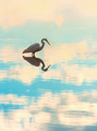
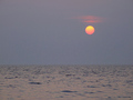
| 08/04/2006 04:08:14 AM |
Patienceby StagoleeComment: this is so elegant, i really like it. i love that there is no horizon, that it almost looks like the water is merging with the sky. my only reservation is that i kind of wish the blues were less cyan, and more blue. a bit of liberal burning might have reduced this... otherwise, super, and it's very tranquil and zen-like. 8. |
 Photographer found comment helpful. Photographer found comment helpful. |
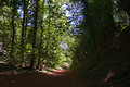
| 08/04/2006 03:51:38 AM |
Silence in the woodsby sarsonukComment: sorry, but this just doesn't convey the ideas of zen to me, really. the composition is a bit off as well because there doesn't really appear to be a single focal point of interest; almost can't see the Woods for the trees... also, the right hand side is too dark and shrouded in shadows. it's probably to do with where you were standing, the mix of bright light and shadow makes it a really technically difficult photo to get a balanced capture, which is frustrating because there looks like a nicely lit area just a few feet ahead of you. 4. |
| Photographer found comment helpful. |
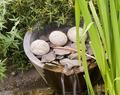
| 08/04/2006 03:46:17 AM |
Zenby mistComment: appreciate that you wanted to get some motion on the water, but the shot feels overall a tad too bright and overexposed. this could have been reduced post processing (just by going mad with the burn tool, and maybe the sponge on the greens to bring them out a bit more). i do think it meets the challenge (feels like elements of a japanese garden) though getting in closer to the rocks and slates might have made it a bit more zenny. 4. |
| Photographer found comment helpful. |
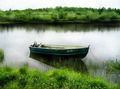
| 08/04/2006 03:42:16 AM |
Beside Still Watersby jah_luvComment: it's very likeable; i love the glass-smooth, slightly diffused glow appearance of the water, the lush greens on the banks and the slightly decrepit look of the boat... what might harm your score a bit is the blown out sky and the fringing colour distortion thing happening to the lines of the trees in the background; cropping below the horizon might have helped a bit. it's also missing something; possibly someone pretending to be asleep in the boat, or something similarly cliched (which is what the voters go for, i think). 6. |
| Photographer found comment helpful. |
| 08/04/2006 03:35:50 AM |
Floatingby cloudsmeComment: i think you've definitely captured some element of the whole zen thing; the lad appears deeply relaxed in an almost medatitive sort of way. the high view point and angle also adds a higher degree of interest, and makes it feel different. the lovely hotel-brochure blueness of the pool just adds to a sense of tranquility; and technically i can't fault any element of the shot, from composition to focus to everything. i like it :) 9 |
| Photographer found comment helpful. |
| 08/04/2006 03:33:25 AM |
My quiet placeby KelliComment: on a personal level, this doesn't feel particularly zenlike to me... the water feels wrong for this sort of harmonious themed challenge. it's hard to put in words, really... the colours feel a bit washed out too; could do with a levels and contrast adjustment possibly. it's nice, but just lacks that special something - 5 |
| Photographer found comment helpful. |
| 08/04/2006 03:27:21 AM |
The decisionby AnastasiaComment: not sure it really conveys the idea of zen to me, but it's still a sensual classy shot... though it does almost look like the girl on the left is about to dig in her nails to the other ones throat... very elegant shot nonetheless; 7 |
| 08/03/2006 05:51:01 PM |
My Father's Shirtby mrezaComment: really can't believe this finished so low, and even harder to believe is that no one else gave you a 9 or higher. i thought this picture was amazing; stylish, moody, different, original... and now i've just looked through all your other entries; they're amazing! they're all excellent, and they all have a corresponding theme in terms of style and feel. they make a wonderful collection or series, and they're all truly artistic. keep at it! |
| 08/03/2006 05:36:16 PM |
The Sun Falls on Key Westby alanfreedComment: it's a nice relaxing sort of shot, and i think it kind of fits the challenge. i does though suffer slightly from an overwhelming feeling of grey; i think increasing colour saturation and slightly moving up the left levels slider would reduce that grey wash it has. can almost hear the schlapping of the waves and seagulls rhead... 6. |
| Photographer found comment helpful. |
| 08/03/2006 05:30:29 PM |
Wine into waterby BoltiComment: the central elements of this shot are gorgeous; how you have achieved the wonderful effect and with such a gorgeous deep red too is stunning. i think i would like more focus on this though; you really don't need ot include the whole glass in the image. perhaps a squarer, or more landscaped crop featuring just the head of the glass (either centred, or more preferably to one side a la rule of thirds) would give a more pleasing composition? 7. |
| Photographer found comment helpful. |
Home -
Challenges -
Community -
League -
Photos -
Cameras -
Lenses -
Learn -
Help -
Terms of Use -
Privacy -
Top ^
DPChallenge, and website content and design, Copyright © 2001-2025 Challenging Technologies, LLC.
All digital photo copyrights belong to the photographers and may not be used without permission.
Current Server Time: 08/16/2025 01:41:56 AM EDT.