|
|
|
Showing 291 - 300 of ~979 |
| Image |
Comment |
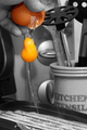
| 08/09/2006 07:46:10 AM | cooking!by Ecce_SignumComment: it's a very likeable idea, this, and a nicely creative take on the challenge. for the most part, i like the idea of the selective desat, though i would have probably made the shell B&W as well, for the following reasons:
principally because the colour of the shell looks a bit odd.
the area of colour would be more centred (feels a bit unbalanced with all the interesting colour stuff up the top)
the shell detracts from the wonderful yellowness of the yolk; so bright and smooth and really fab
also, the only other real criticism is that the background has a bit of a conflict of ages. there's too much stuff (i think a simple plain or tiled background might be more effective and less distracting), though i love the utensil jar (looks rustic and old) but not too keen on the black circular implement (i get totally lost in the kitchen, don't know what it is) and the modern electrical appliance at the back. also, might have cropped above the tray... ANYway, none of that doesn't mean i don't like it, i do! i think it's cute, it's been greatly captured and timed, fits the challenge really well, and the desat against the yellow is really cool. 7. |  Photographer found comment helpful. Photographer found comment helpful. |
| 08/09/2006 04:42:18 AM | Gunshotby PanoComment: very cleverly staged, i'll admit that. personally don't think that the guys head actually adds much to the overall composition; to me his expression is such that makes the whole thing a bit, erm, silly i suppose... technically it's really good, but in terms of striking an appealing chord with me, doesn't quite do it... personal taste i suppose. erm, 6. | | Photographer found comment helpful. |
| 08/09/2006 04:22:40 AM | Above the Rimby JamesKWComment: i like the colour treatment in this picture, i think the light grain and the high contrasty feel adds a lot to the overall style. it also draws the eyes direct to the ball, so that seems most effective. unfortunately, it also makes the slight blur to the edge of the ball a bit more obvious, which lets the quality down a little bit. i'm also not that keen on the border; i appreciate that the style kind of emulates that of the board behind the net, but it just seems to fussy here. but, overall, i like this mcuhly. 7. | | Photographer found comment helpful. |
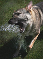
| 08/08/2006 10:00:48 AM | Summer's Hose Gameby BalkoComment: i totally adore this picture; i honestly think it's wonderful. there is so much style here. i love the EVER so slightly muted colours, the crop, the EVER so slight grain... i love the slightly rough feel of it - kind of reminds me of polaroids really. it has buckets of character. you know, so many pictures here get processed within an inch of their life, super smooth, overly dodged and burned; icelandicised I suppose. this is so refreshing, power to you and very well done :) 10. | | Photographer found comment helpful. |
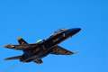
| 08/08/2006 09:37:59 AM | Mach 1.5by jbsmithanaComment: was it a family outing, then ;) it's a nice shot, and not having four in formation does make it stand out. to a degree, i think less is slightly more, but it feels a bit unreal. not sure why, but there is no sense of movement in this picture. it's obvouisly an excellent stopped motion capture, but it feels too still life. i think the sky might be part of the problem; it's so perfectly blue yet flat it could almost be a sheet of card behind a suspended model... 6. | | Photographer found comment helpful. |
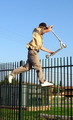
| 08/08/2006 09:05:31 AM | Airborn Razorby PanderComment: it's a great capture in terms of timing, but the background is far too messy and visually unappealing. it's a big distraction from the action, really. it's also a bit of a shame that his arm is obscuring most of his head... these things do let down what is otherwise a great image; the sense of height (grudgingly heightened by the messy railings!) is really effective. 6. | | Photographer found comment helpful. |
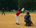
| 08/08/2006 08:55:06 AM | A decision moment of "Hit" or "No Hit".by FocusPointComment: it's hard to cast a vote on this one. in terms of fitting the challenge, only the ball is really caught in motion, and it only fills a small percentage of the shot. did you try getting the batter mid-swing? i don't know if there'd be much pixel distortion, but i might have been tempted to do a square crop just isolating the top half of the batter, the ball thrower (apologies for naff terminology) and maybe a portion of the crouching bloke. and it just occured to me that i think it is suffering a little from too much to look at; doing a burn and more of a background blur (which you can do i think in advanced rules) would lessen the distraction from all the cars and stuff... 5. | | Photographer found comment helpful. |
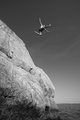
| 08/08/2006 08:46:42 AM | Precisionby Dr.ConfuserComment: ha! i wonder if this was taken at the same display as the other one? it's effectively dramatic, but to me the aircraft feel a little cramped within the frame; i think a bit more sky would be nice. certainly fits the challenge, and is nice and sharp. it just lacks a certain something... 6. | | Photographer found comment helpful. |
| 08/08/2006 08:41:50 AM | Crushing Chromaticityby CutterComment: clearly people here have an angewr against the humble light bulb... i do like the details in this picture; the bright colours in the background is creatively original and rather striking, and the head of the has an interesting aged style. i like that the focus is on the hammer rather than the bulb. i'm not sure what the black thing on the left is though; it oddly doesn't look wrong, but i am spending too much time trying to figure it out... i like it's slightly wierdness; 9. | | Photographer found comment helpful. |
| 08/08/2006 08:37:06 AM | Into the seaby chakkobboComment: superb stuff! colours, composition, the jumpers poncy flash pose, it's all great. the grey almost bluescale really works well and adds atmosphere... the only last thing i might do is clone out the little bird, but it's not majorly distracting... excellent. 10. |
|
Showing 291 - 300 of ~979 |
Home -
Challenges -
Community -
League -
Photos -
Cameras -
Lenses -
Learn -
Help -
Terms of Use -
Privacy -
Top ^
DPChallenge, and website content and design, Copyright © 2001-2025 Challenging Technologies, LLC.
All digital photo copyrights belong to the photographers and may not be used without permission.
Current Server Time: 08/15/2025 01:18:09 PM EDT.
|