|
|
|
Showing 241 - 250 of ~979 |
| Image |
Comment |
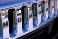
| 08/14/2006 11:46:46 AM | HUMMER transports you!by kaidaehnkeComment: i only voted this a 4, i'm afraid. i just didn't connect with the shot in any sort of way... i think more of the car than just the grille might have proved more wow, because, and let's face it, the hummer is a silly looking car and a picture showing how silly might be more fun than this almost too modestly sensible look at it. plus, i thought there was too much going on reflected in the chrome (not including the half a dozen versions of you!). if it was parked closer to the beach, and only sky and sand and sea was reflected, i think that might be more effective. just my thoughts, really. |  Photographer found comment helpful. Photographer found comment helpful. |
| 08/14/2006 11:40:40 AM | Early Flight Outby karmatComment: when i voted, i gave this a 4. though there are aspects i liked, i felt the discolouration and fringing in the sky and on the near wing to be excessive. the smoggy haze, the brownness of the runway, and the look of the other aircraft in terms of angle, lighting, feel, are all really good. it's the sky, plus that really bright reflection on the tail, that lets you down. |
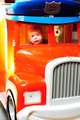
| 08/14/2006 11:10:07 AM | Firefighterby Shiva DasComment: nice family photo; the colours and lighting are a bit harsh though - kind of have rpreconceived ideas that a fire engine should be red, and this looks mostly orange. it's also not really within the realms of transportation, to be honest. it's a fun photo, but not really arty farty enough for dpc i'm afraid. 4. |
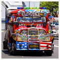
| 08/14/2006 08:59:52 AM | "Jeepneys" (Our Local Pride)by davidus428Comment: i gave this an 8. generally, i like it very much; it's immediately striking, bold, bright and colourful, and the car itself is rich in character, kitsch and cultural value. the only real criticism is that the angle is a bit too head-on for the unitiated to work out it's a bus, and the background is really bland and doesn't go well with the outlandish nature of the vehicle. there's also the lack of humans, which in this case is a bit sad because i always think of these things as a social type thing. but it's still a lovely shot, and so unashamably happy that it's infectious. so 8. | | Photographer found comment helpful. |
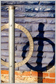
| 08/14/2006 08:51:47 AM | parkingby agenkinComment: doesn't really say transportation to me, i'm afraid. the purply blue painted brickwork is quite appealing (might have been tempted to crop above the red brick, thereby making more duotoney) but generally, it kind of lacks that wow factor to make it stand out. 4. | | Photographer found comment helpful. |
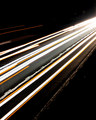
| 08/14/2006 08:48:13 AM | This Is How We Get Thereby Psych0phobiAComment: i'd have cropped this more square from the bottom, keeping the same width. the brighter lights in the corner are a major distraction, and the top left orange lights don't really fit in. otherwise, it's a reasonably striking abstract shot; and the title is a rather lovely choice. but for me, overall, it leaves me a bit cold. sorry. 4. | | Photographer found comment helpful. |
| 08/14/2006 08:44:36 AM | Night Lightsby kcgrizComment: nice, but i think a longer exposure would have made it a bit more dramatic giving longer streakier red lines. the image is suffering a bit from the white spots right in the middle, and the buildings are too interestingly lit and divert attention from the road. you need fewer things drawing the eye. 4. | | Photographer found comment helpful. |
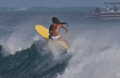
| 08/14/2006 08:41:55 AM | Transportation on the Crest of a Waveby chaliceComment: this feels very, very much like a painting, but it the style suits the subject matter, and it adds a greater degree of interest. composition and colours are a treat, and the boat in the background adds to rather than detracts from the shot. i'm deeply impressed at the moment you caught this; her posture is so dynamic, and the way she's riding the wave is actually arty itself. 10. | | Photographer found comment helpful. |
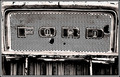
| 08/14/2006 08:37:18 AM | Revolutionby ShannonLeeComment: the post processing on this has led to the image looking (to me) really flat and not particularly inspiring, even though the name / badge you have captured is steeped in world-changing history. the border feels odd too, for some reason. 4. | | Photographer found comment helpful. |
| 08/14/2006 08:34:50 AM | Gone with the windby GunnsiComment: hmmm. transportation isn't really the same as something being transported... i dunno - does wind qualify? it's nicely captured, though i think it's a little on the dark side; the colours feel a bit dull (i think the background is a bit bland and overpoweringly black). 4. | | Photographer found comment helpful. |
|
Showing 241 - 250 of ~979 |
Home -
Challenges -
Community -
League -
Photos -
Cameras -
Lenses -
Learn -
Help -
Terms of Use -
Privacy -
Top ^
DPChallenge, and website content and design, Copyright © 2001-2025 Challenging Technologies, LLC.
All digital photo copyrights belong to the photographers and may not be used without permission.
Current Server Time: 08/15/2025 11:36:54 AM EDT.
|