| Image |
Comment |
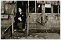
| 02/22/2006 01:21:59 AM |
All By Myselfby Sunshine86Comment: I like the mood of the photo. Leaving more room in the direction the person is looking should improve composition. |
 Photographer found comment helpful. Photographer found comment helpful. |
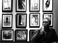
| 02/22/2006 01:20:50 AM |
photo exhibitby ronragComment: I like the photo, stands out from the rest of the entries here. I just wish the whites weren't blown out on the right side of the photo. Also, the top row of photos cut of is bothering me a little. But, I like the photo overall. |
| Photographer found comment helpful. |
| 02/22/2006 12:58:16 AM |
|
| 02/22/2006 12:57:49 AM |
|
| Photographer found comment helpful. |
| 02/22/2006 12:55:46 AM |
one tulipby tcmartinComment: I like the photo, there just doesn't seem to be enough contrast. The dark areas do not get black, just grey. |
| Photographer found comment helpful. |
| 02/22/2006 12:54:20 AM |
Lost Worldby edmengComment: Great landscape, its just too bad there is no foreground, it would have added some depth to the photo. |
| Photographer found comment helpful. |
| 02/22/2006 12:53:31 AM |
|
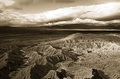
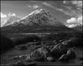
| 02/22/2006 12:46:27 AM |
Buachaille Etive Morby TallblokeComment: I wish there was a little more definition in the shadows, that would be pretty easy to bring out with advanced rules. Other than that, a great job. |
| Photographer found comment helpful. |
| 02/22/2006 12:45:14 AM |
|
| Photographer found comment helpful. |
| 02/07/2006 06:53:37 PM |
|
| Photographer found comment helpful. |
Home -
Challenges -
Community -
League -
Photos -
Cameras -
Lenses -
Learn -
Help -
Terms of Use -
Privacy -
Top ^
DPChallenge, and website content and design, Copyright © 2001-2025 Challenging Technologies, LLC.
All digital photo copyrights belong to the photographers and may not be used without permission.
Current Server Time: 08/04/2025 02:55:19 AM EDT.