| Image |
Comment |
| 02/18/2004 07:16:22 PM |
Work Hatby PopcornheadComment: Having better lighting, and background would help this photo a lot. |
 Photographer found comment helpful. Photographer found comment helpful. |
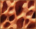
| 02/18/2004 07:15:36 PM |
SOLEby Polecat123Comment: Improve the focus, and get a subject in the picture, and it would be much better. By getting a subject I mean not having a pattern, but something that stands out in the pattern. |
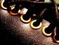
| 02/18/2004 07:14:22 PM |
Leather Braceletby Apollo2077Comment: A little oversaturated in my opinion, some may like it, but not me. Having softer lighting would also help. |
| Photographer found comment helpful. |
| 02/18/2004 07:12:13 PM |
Textures of Musicby deegeComment: A stretch of the topic. Getting the camera up above everybodies heads, and getting rid of the motion blur, or out of focus would help. |
| 02/18/2004 07:10:42 PM |
Stepsby novetanComment: The lighting is too harsh in my opinion, might have been your intent, but I don't like it very much. with softer lighting, and a subject in the photo this would be good. |
| 02/18/2004 07:08:03 PM |
Inconspicuous Smoothness of an iPodby XarthanComment: You could've shown the smooth texture better. Having brighter lighting, and more reflections of of the surface would have helped. I also think that the bright screen is a little distracting. |
| 02/18/2004 07:05:47 PM |
Unused Spongeby ChrisW123Comment: That dark hole on the right draws my attention too much, I don't think you ment that to be your subject. When taking photos like this its better for something to stand out, and not just have a random pattern. |
| Photographer found comment helpful. |
| 02/18/2004 07:04:15 PM |
Web in my kitchenby gatchamanComment: You should have put the middle of the web on one of the thirds of the photo (rule of thirds). You should have tried to be a little more creative with your perspective, and composition, but the photo has potential. |
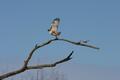
| 02/17/2004 10:57:59 PM |
LUCKY SHOTby Rando D300Comment: A tighter crop would be better, but I understand how hard it is to capture a bird, especcially in a unique pose. I think you can improve the composition, the branch makes it interesting, but it could be better. Maybe moving the frame to the left so the bird is on the right half. |
| Photographer found comment helpful. |
| 02/17/2004 10:51:56 PM |
Letting go?! any feelings?!by kinksComment: I like the effect (used a similar one in my shot). Ithink it would work better with a dark background. This is because you wouldn't see through the hand as much, and would fit with the picture better, I assume you weren't trying to get a happy mood out of it. |
| Photographer found comment helpful. |
Home -
Challenges -
Community -
League -
Photos -
Cameras -
Lenses -
Learn -
Help -
Terms of Use -
Privacy -
Top ^
DPChallenge, and website content and design, Copyright © 2001-2025 Challenging Technologies, LLC.
All digital photo copyrights belong to the photographers and may not be used without permission.
Current Server Time: 08/04/2025 06:50:00 PM EDT.