| Image |
Comment |
| 03/13/2006 09:14:14 AM |
Hang Timeby idnicComment: Originally posted by Pug-H:
shhh, don't tell him, but I rated this higher than rikki's shot ;-0 |
:D Thanks, Pug! |
| 03/13/2006 01:06:20 AM |
|
 Photographer found comment helpful. Photographer found comment helpful. |
| 03/13/2006 01:05:41 AM |
|
| Photographer found comment helpful. |
| 03/13/2006 01:04:34 AM |
"Dune" by Frank Herbert by SammieComment: Not only my favorite of all the novels I've ever read, i've read this series (all 6 books) about 5 times. The orange-ish color here makes the shot. This image is sooooooooo perfect for the title, you get bonus points because I know what you mean! :) |
| Photographer found comment helpful. |
| 03/09/2006 11:50:04 AM |
|
| 03/09/2006 10:19:02 AM |
|
| Photographer found comment helpful. |
| 03/09/2006 09:24:16 AM |
|
| 03/05/2006 01:06:29 PM |
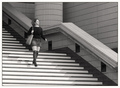
Stripesby ArtanComment: Greetings from the Critique Club. Let me begin by saying - cracker of a shot! I really love all the angles and lines in this shot and yes, the model's socks play sooooo well into the surrounding scene. Exposure looks great, focus is clean, everything fits in this image very well. I really can't pick on anything or make any suggestions for improvment. Congratulations on a lovely shot.
Good luck with your future entries,
Cindi
|
| Photographer found comment helpful. |
| 03/03/2006 07:01:36 PM |
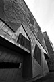
Leaningby dimmyComment: Greetings from the Critique Club. This building is very interesting with very cool textures and angles - I can't help, however, thinking you might have chosen a different angle that would show off the building's architecture better. This flat angle just doesn't seem to do the building justice. Also the sky - an old photographer saying is "seen one blue sky, you've seen em all" - meaning a blank flat sky is fairly uninteresting. For overall improvement of this shot, I would suggest, besides the change of view-point, either waiting for an interesting sky, or composing the shot to not include the sky - or very little of it.
These comments are meant to be helpful, I hope you find them so.
Good luck
Cindi |
| Photographer found comment helpful. |
| 03/03/2006 10:29:33 AM |
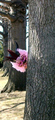
Stepsby realpdmComment: Greetings from the Critique Club. This image is well composed and has an attractive graphic look, however the light is a bit bright on the leading edges of the stairs and the image has a flat look. I belive you could improve this shot quite a bit by adding more contrast and correcting curves or levels as needed.
An idea for an alternate shot in this location (not for this challenge obviously) - one flower or other bright colored object set on one of the bricks. :)
These comments are meant to be helpful, I hope you find them so.
Good luck
Cindi |
Home -
Challenges -
Community -
League -
Photos -
Cameras -
Lenses -
Learn -
Help -
Terms of Use -
Privacy -
Top ^
DPChallenge, and website content and design, Copyright © 2001-2025 Challenging Technologies, LLC.
All digital photo copyrights belong to the photographers and may not be used without permission.
Current Server Time: 08/26/2025 05:04:14 PM EDT.