|
|
|
Showing 1261 - 1270 of ~2606 |
| Image |
Comment |
| 09/03/2014 08:56:48 PM | circus of heavenby skewsmeComment: I love this, it feels like a painting. The sharp butterfly, the the blur of purple and orange floral, really lovely. |  Photographer found comment helpful. Photographer found comment helpful. |
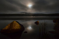
| 09/03/2014 08:53:29 PM | Moonlit Reverieby levyj413Comment: I love the colors and smoothness in this image. I like how the foreground rocks lead my eye to the lovely mountains and low clouds/fog in the background. Just beautiful. | | Photographer found comment helpful. |
| 09/03/2014 08:51:16 PM | Mustang Man by littlemavComment: I really enjoyed this image. I like the like and the muted colors and I love the emotion on your cowboy's face. | | Photographer found comment helpful. |
| 09/02/2014 10:31:41 PM | | | Photographer found comment helpful. |
| 09/02/2014 10:31:03 PM | Balloon Bikieby naomikComment: I liked the shadows in your shot, and I like the simplicity of color here - it really made the 'white' balloons stand out. | | Photographer found comment helpful. |
| 09/02/2014 10:30:03 PM | Garden of Evilby PennyStreetComment: I love that crazy balloon. And IMHO those ferns are a perfect match. This made me think of a tiki party - and that made me smile. Thanks! | | Photographer found comment helpful. |
| 09/02/2014 02:15:08 PM | Vintage paintby gminkComment: *Greetings from the Critique Club*
Just your luck to get a critique from me twice in a week, on two somewhat similar images. (Sorry I can't throw it back in the mix to let you hear someone else's thoughts on this image. But I'll try to be original.)
From glancing through your portfolio, you excel at finding creative examples of challenge topics. I love this kind of stuff, but it doesn't appear these types of images often land on the front page. I however love the thoughtfulness and uniqueness of images like this.
Compositionally, I think your image works. You have nice texture and colors and areas where I see movement. I especially like how the peeling paint kind of rains down from the top of the photo, that was great planning but possibly too subtle to be appreciated by voters moving quickly.
Technically I think your image is strong. There is sharpness at the edges of the peeling paint, although it a bit compressed perhaps. I wonder what focal length you used. Were you zoomed in or did you crop the photo? When I look closely at the edges of that peeling paint it seems a bit of texture is lost. I like the shade of red, and the gray and white are a nice contrast to the red.
You image certainly met the challenge IMO, and you had several very high scores - so nicely done. It appears that most of those in top ten were images of objects that people identified as vintage, and I suspect your subtle take on the challenge just didn't lead to top scores by the masses. But I do not see any obvious weaknesses to your image overall.
Keep shooting and submitting. It was a pleasure spending time with your photo.
Julee
|
| 08/29/2014 02:40:52 PM | Totemby eaxthelmComment: Greetings from the Critique Club
Congratulations on a great score and a beautiful image.
Compositionally this image works very well IMHO. The strong foreground subjects leading to a blurred, yet identifiable background is really nice. I do have to admit that it took me a long while to feel like I sort of understood the image. I kept thinking there was some sort of totem in the glass - only after about 5 minutes did I realize the liquid in the glass was tilting - my eyes just kept seeing something that looked like a cylindrical glass object - even though I had grasped the tilted floor - but even that was really subtle. (Also, even now my brain is not able to connect your title to any meaning. Sorry.) But the longer I look at this shot the more I love it. Yours is an image that really requires, and deserves thorough consideration. Possibly more consideration than voters tend to give when voting.
Technically, I love the colors in this image. The gold, faded pink, and subtle blue really work well together and to me give this image a very mysterious feel. The foreground subjects are very sharp, and the background has a lovely, gentle blur. The lighting is beautiful.
I am not sure I can identify any true weakness to this image. There is an area around the glass that is very dark, seems black, where I do not see any detail. I am not sure that hurts this image since there is darkness around the man so I might expect an area of blackness. I also noticed the neat shadow under the man's arm, is that from the arm or the glass? I'm not experienced enough with shadows to know if the shadows all match up. If the long shadow is the glass, is that small shadow next to the primary shadow the dice? Or if the long shadow was of the arm, should there be a corresponding shadow for the glass and the dice? (I don't have the answer, just questions I had. None of that affected my enjoyment of this image.)
Thank you for the entry. It was a pleasure spending time with your image. I look forward to more photographs from you.
Julee |
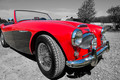
| 08/28/2014 04:24:49 PM | Austin Healey 3000 Mk IIIby Dr.ConfuserComment: Greetings from the Critique Club
First off, I enjoy selective desaturation (although I've heard that many at DPC aren't huge fans). But I think a shot like this, where you've got a beauty of a singularly colored subject, can be strengthened with the one pop of color. But that's just me. I will admit the red on my screen is really bright,
Composition of your image, IMHO, is good. I like the near filled-frame with this hot car. There is what appears to be a parked car behind your subject, along with some sort of building with a white roof next to that car. That took away a bit from the clean lines of the car. (It took my eyes a minute or so to figure out that they were background items, they seemed part of the car at first to me.) I wonder if a slightly lower perspective might have eliminated those two objects from view. I suppose you had a bit of bad luck with the sky not being overly interesting, but with my eye drawn so strongly to the car, I'm not sure a wild sky was a critical issue. The trees don't add much to the image for me, but I'm not sure they're a problem either since they blend in fairly well and are easily identifiable as trees not the car.
Technically I think your image is very good. The red looks great and your subject, the whole subject, looks very sharp. I noticed a strong shadow beneath the car, but it really did not take away from my experience of your image. I do not see any harsh reflections on your car, so nice work there.
Overall I think you had a strong image. I did not vote in this challenge, so it's hard to say what I would have thought during the challenge, but I'm not sure I would have recognized this as a 'vintage' car. It looks so bright and shiny and new, and it just doesn't look like other classic cars I'm familiar with. But after googling, which I would have done during the challenge, I see indeed it is fairly old.
Thanks for the entry. I enjoyed spending time with your image.
Julee |
| 08/28/2014 12:18:25 PM | | | Photographer found comment helpful. |
|
Showing 1261 - 1270 of ~2606 |
Home -
Challenges -
Community -
League -
Photos -
Cameras -
Lenses -
Learn -
Help -
Terms of Use -
Privacy -
Top ^
DPChallenge, and website content and design, Copyright © 2001-2025 Challenging Technologies, LLC.
All digital photo copyrights belong to the photographers and may not be used without permission.
Current Server Time: 08/23/2025 11:39:00 PM EDT.
|