| Image |
Comment |
| 09/15/2014 09:49:25 PM |
|
 Photographer found comment helpful. Photographer found comment helpful. |
| 09/11/2014 07:58:22 PM |
The Mothershipby Ja-9Comment: *Greetings from the Critique Club*
Congrats on a great score and strong finish!
Compositionally this is beautiful. There is one strong, main subject, with smaller bubbles leading my eye throughout the image - love that effect. But I have to admit that the play of the pink and the yellow did not work completely for my eye. The yellow in the large bubble was so vibrant, and the color almost seemed to move into a bit of orange on the left side. That main bubble also seems a bit harsh compared to the softness in most of the rest of the image. The pink in the lower half of the image I found gorgeous, but then at the top of the image, on the right, where it mixed some with the yellow, it came off a bit 'dirty' looking to me. In the smaller bubbles the colors are great, but that large bubble just didn't seem to complement completely.
Technically I don't see any flaws in this image. The bubbles are very sharp, the lighting is soft and lovely. The pattern of your background is reflected perfectly in those smaller bubbles. Great effect!
Well done.
Julee |
| Photographer found comment helpful. |
| 09/11/2014 07:43:45 PM |
COLORATIONby KMcCComment: *Greetings from the Critique Club*
This was one of my favorite images of the challenge, so critiquing could be tough. I have to admit that I think you photo was highly underappreciated in the challenge. That said...
Compositionally I like what I see. The subject fills the frame. The challenge was to be abstract, and I think you hit a home run. I even see a bit of framing with the white edges, and that makes this feel like a complete image to me. The image does feel a bit flat, like a flat object was photographed - which perhaps turned some voters off? But you have a nice, abstract pattern of color going which also made the photo interesting to me.
Technically I think the image is good. The colors are lovely although perhaps the stark white 'strips' in a few places, where there appears to be a loss of detail, bothered some voters. To me that just added to the abstract element and did not take away from my enjoyment of the image at all. There might be a bit of softness to the shot, but to me again, this worked perfectly to create a wonderful abstract piece of art.
Thanks for sharing. I loved what you created.
Julee
|
| Photographer found comment helpful. |
| 09/10/2014 09:34:50 PM |
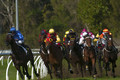
Tight on the Turn by Gordon_1Comment: *Greetings from the critique club*
Boy, no apologies needed for entering this shot, I think it is quite good.
Compositionallly I love the prominence of the horses in the foreground, really neat. To my eye the trees in the background don't add much to your shot and I wonder if a tighter crop, bringing the whole image right on those gorgeous racers, might strengthen the shot a bit. (I think you could remove those trees at the top of the image and even the racer in blue in the left.)
Technically I think your image is really good. Your colors are great and the shot looks very sharp (at least to my eye). And your settings captured that action, really nice work. I love all that floating dirt and dust. The image comes off as perhaps a bit dark, like maybe it was underexposed a bit. But the rider's outfits really pop, so added brightness might not improve the shot.
I think this was a solid entry. Well done.
Julee
|
| 09/10/2014 01:56:24 PM |
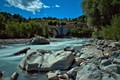
Motion Under the Blue Skyby Edwardho94Comment: *Greetings from the Critique Club*
First off, welcome to DPC. It's great to see you getting active right away.
Compositionally, I love what you chose for the foreground. The rocks are interesting and the water lead my eye towards the back of the image. I was not as in love with the back area of the image. I liked the bridge, but the other buildings and details (flags) seemed to distract me a bit. I am also not sure that the large bush/tree sticking out on the right added much to your image. I wonder what a crop off that right side, or a crop off the bottom and right would have done?
Technically I think this is a good image. Your water is gorgeous, really nice. I like the colors in the water and rocks and greenery, but the blue of the sky seems a bit vibrant (but that could just be me). The softness of the clouds seemed to add a bit to the sky being off for me, but since that was a side effect of a longer exposure I'm not sure what an alternative might have been.
Overall this is a good image, I would have been interesting to see what other perspectives might have looked like had you moved the tripod around some. Keep up the good work. I look forward to seeing more of your images.
Julee |
| Photographer found comment helpful. |
| 09/10/2014 01:43:58 PM |
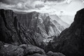
Follow the light by Silent-ShooterComment: *Greetings from the Critique Club*
Congratulations on the ribbon. Beautiful shot. Third place in a free study, amazing light, sharpness, and tones... Nothing to critique here. Well done.
Julee |
| Photographer found comment helpful. |
| 09/10/2014 01:42:55 PM |
|
| Photographer found comment helpful. |
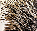
| 09/10/2014 09:03:03 AM |
Mission 143.1.19by olbolComment: I loved this shot, should have scored much higher IMO. There were great leading lines and I found the colors very pleasing. This also felt very abstract and macro to me. (I would have guess it was a shot of a loofah.) |
| Photographer found comment helpful. |
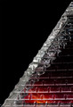
| 09/08/2014 01:59:11 PM |
ice stairwayby magueroComment: Very pretty. I love the transition of color from orange to red to black which is contrasted by some mysterious white ice. |
| Photographer found comment helpful. |
| 09/08/2014 01:52:38 PM |
cold shoulder by mitalapoComment: It looks like a blue jay. (But I suspect it's totally not.) But that blue and mauve I thought was really nice. |
| Photographer found comment helpful. |
Home -
Challenges -
Community -
League -
Photos -
Cameras -
Lenses -
Learn -
Help -
Terms of Use -
Privacy -
Top ^
DPChallenge, and website content and design, Copyright © 2001-2025 Challenging Technologies, LLC.
All digital photo copyrights belong to the photographers and may not be used without permission.
Current Server Time: 08/24/2025 04:59:58 AM EDT.