| Image |
Comment |
| 07/23/2012 05:14:26 PM |
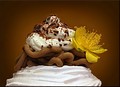
Vermicelleby kasabaComment: I like the background spotlight that gives a halo to your subject. I feel like the whole image has a little too much brown, though. The flower is a nice tough and is well-placed, although I feel it should be a brighter yellow. It feels like you left too much room all around the edges, especially on the left side and bottom. |
 Photographer found comment helpful. Photographer found comment helpful. |
| 07/23/2012 05:09:59 PM |
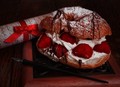
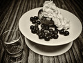
Notes of Sweetnessby CNovackComment: Overall the image seems a bit dark. The scroll seems a little distracting and perhaps should be more blurry -- it also goes right through your subject and should have been laid so it's more up-and-down. |
| Photographer found comment helpful. |
| 07/23/2012 05:07:14 PM |
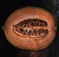
Simply Luscious (some assembly required)by Bear_MusicComment: You did a nice job of lighting the fruit to capture the texture and color variation. The most interest part is in the center and if you zoomed in close to that it seems like it would greatly increase the impact. |
| Photographer found comment helpful. |
| 07/23/2012 05:04:21 PM |
Single 'n' sweetby damoninjaComment: I really like that you took a more artistic approach and didn't just make a pretty dessert and present it formally. For this one I would prefer the contrast not be dialed up quite as high but I like how it gives your pink cupcake a more sinister look! The cupcake seems to disappear into the background on the upper left corner, and if the entire left side did that it would have been nice to see that in the frame. |
| Photographer found comment helpful. |
| 07/23/2012 04:58:35 PM |
Pretty Please..by FtWorthphotogComment: The eye-level viewing angle and conservative cropping make the presentation very plain. It also feels like too much of it is in shadow and could do with more even lighting. |
| Photographer found comment helpful. |
| 07/23/2012 04:56:47 PM |
You CAN have it and EAT it too!!!by maz001Comment: You could crop this much closer on the sides and bottom, even to the point of losing some of the cake, without losing context. The presentation doesn't quite match the concept: the concept is whimsical but the presentation is a little plain, with everything evenly spaced and centered. |
| Photographer found comment helpful. |
| 07/23/2012 04:56:44 PM |
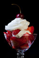
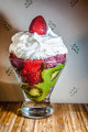
Berries and Kiwiby LawtonComment: It looks delicious! Overall it's nicely lit and photographed and has good colors, but the presentation is fairly plain. The pattern in the wallpaper only serves to distract from the subject. |
| Photographer found comment helpful. |
| 07/23/2012 04:56:36 PM |
|
| Photographer found comment helpful. |
| 07/23/2012 04:51:42 PM |
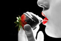
A Girl's Favoriteby jusjoshingComment: I like the concept and the combination of red strawberry and lips. I feel like a little too much of the image is blown out and loses its details. |
| Photographer found comment helpful. |
| 07/23/2012 04:49:24 PM |
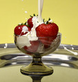
Wimbledon's Smashing Treatby KroburgComment: I really like the concept of freezing the motion of the cream as it strikes the strawberries and it's one of my favorite ideas in the challenge. However, the choice of a fairly low viewing angle, formal upright presentation and wide crop rob the concept of a lot of its energy. If you tilted it about 45 degrees to the right and cropped it tight to just the strawberries it would have lots of action. The goblet and the platter are not the interesting parts of the image and they should be eliminated almost entirely. Also, it may be my monitor or the background but the white balance looks a little too yellow. |
| Photographer found comment helpful. |
Home -
Challenges -
Community -
League -
Photos -
Cameras -
Lenses -
Learn -
Help -
Terms of Use -
Privacy -
Top ^
DPChallenge, and website content and design, Copyright © 2001-2025 Challenging Technologies, LLC.
All digital photo copyrights belong to the photographers and may not be used without permission.
Current Server Time: 08/20/2025 01:54:56 AM EDT.