| Image |
Comment |
| 07/31/2012 09:54:27 AM |
Love Templatesby talzamComment: I would contend that this doesn't fit the challenge because your subjects are the boats, which aren't silhouetted. I like the framing of the boats but the grey edge of the wall is a little ugly and maybe you could have gotten that out of the frame and had more river inside the frame. |
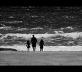
| 07/31/2012 09:28:51 AM |
Beach photographerby gminkComment: When you selected the figures and the ground, it looks like you didn't use enough points so the dark parts look like rough paper cutouts. If the outlines were smooth and more natural-looking it would add much interest to the photo. |
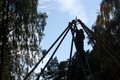
| 07/31/2012 09:26:44 AM |
046by saraclicksComment: There's not a lot to draw interest, just a man in front of some lights, square in the middle of the frame. You have much more context than you need so I would crop it much tighter. |
| 07/31/2012 09:23:37 AM |
constructionby MonaComment: The shapes are partially obscured by the trees. If you stepped forward and to the right you might have had a nice framing between the trees. |
 Photographer found comment helpful. Photographer found comment helpful. |
| 07/31/2012 09:22:13 AM |
Giddy - Up Cowboyby candylandstarrComment: It might add more interest if the shadows were darkened to make the lines stronger. Also, not a silhouette, but I'm sure everyone has said that. |
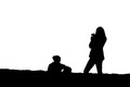
| 07/31/2012 09:20:09 AM |
Dad and the Kidsby sfaliceComment: Your people look like paper cutouts and their outlines are oddly-shaped, particularly the smaller girl's hands and feet. It looks like your people weren't back-lit to begin with, but you individually selected them and darkened them down to turn them black. It's impossible to turn something that wasn't already back-lit into a silhouette without making it look artificial because there's no reason for them to be so dark. |
| Photographer found comment helpful. |
| 07/31/2012 09:16:07 AM |
Soldierby ttroutman71Comment: The imagine is very blue. Blue clouds on blue skies, blue reflections on the statue. The composition is very plain, rigidly straight up-and-down and centered neatly in the frame and lacking any pizzazz. |
| Photographer found comment helpful. |
| 07/31/2012 09:12:12 AM |
The sun is going to set... MEOW!by aquaman1227Comment: If the cat contrasted more from the background it would make a more intriguing photo. I'd also leave more room on the right side, in the direction the cat is looking. |
| 07/31/2012 09:07:44 AM |
Fire in the skyby doctabrezComment: It's a pretty sunset, but they happen all the time. A sunset photo generally needs something else in the foreground to lend some context, especially in a silhouette challenge. Maybe that's why the powerline in there, but it's a distraction more than a major element of the photo. |
| Photographer found comment helpful. |
| 07/30/2012 05:06:57 PM |
Chloeby bobonacusComment: Great job of selecting a pose that makes beautiful lines as well as catching the lights just right to produce thin outlines. It's a shame but I'm sure a lot of people will say it's not a "true" silhouette and mark it down. |
| Photographer found comment helpful. |
Home -
Challenges -
Community -
League -
Photos -
Cameras -
Lenses -
Learn -
Help -
Terms of Use -
Privacy -
Top ^
DPChallenge, and website content and design, Copyright © 2001-2025 Challenging Technologies, LLC.
All digital photo copyrights belong to the photographers and may not be used without permission.
Current Server Time: 08/20/2025 07:09:32 AM EDT.