| Image |
Comment |
| 02/02/2005 11:09:18 PM |
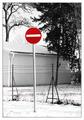
No way!by vadviragComment: Nice selective desaturation but the contrast on the B&W is a little to harsh. Perhaps it is the snow. I also find the the image has a lot of noise in it. Great positioning on the sign tho. Good luck in this challenge. |
 Photographer found comment helpful. Photographer found comment helpful. |
| 02/02/2005 11:07:09 PM |
Dear Silvia....by AzrifelComment: Interesting road sign to say the least. One can only assume that it from a fatal accident. Nice composition and great colors. Good luck in this challenge. |
| Photographer found comment helpful. |
| 02/02/2005 09:13:30 AM |
|
| Photographer found comment helpful. |
| 02/02/2005 09:08:07 AM |
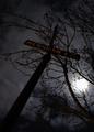
Merging in the moonlightby SondaComment: Sorry I had to give this a 2 because it is extremely out of focus. I like the dark clouds and the silohouette of the pole but the focus just makes it to hard to look at. |
| Photographer found comment helpful. |
| 02/02/2005 09:06:20 AM |
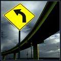
Good advice by BrennanOBComment: I find the grey in the border to be a little to much. Nice vibrant colors in the sign tho and it goes well with the highway. Good luck in this challenge. <6> |
| Photographer found comment helpful. |
| 02/02/2005 09:05:02 AM |
ONLY | ONLY | ONLY | ONLY | ONLYby BradComment: lol the second photo I seen with some humour. Good colors and clarity and a funny sign. Not to bright and great positioning of the sign well done. Good luck in this challenge. <7> |
| Photographer found comment helpful. |
| 02/02/2005 09:03:50 AM |
Shop now, repent later!by NitinComment: I find this photo lacks interest. It has excellent colors and clarity but it does nothing for the viewer. Good luck in this challenge. |
| Photographer found comment helpful. |
| 02/02/2005 09:02:22 AM |
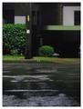
No. 22by thommoComment: In my opinion this looks like a last minute entry to meet the challenge. It looks like you saw this as you were driving by and took a snap shot. I do like the wet road look but it looks like that is the only thing in focus. Good luck in this challenge. |
| 02/02/2005 09:00:57 AM |
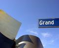
A Grand Concert Hallby beckettbootsComment: I'm not fussy on this shot. I find the shadows on the building is a little to much altho I know you had no control over it. I also find that the sign looks like it was pasted in rather then being part of the picture even if it wasn't. Excelent color and clarity tho. Good luck in this challenge. |
| Photographer found comment helpful. |
| 02/02/2005 08:58:17 AM |
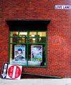
Down'n'Out on Love Laneby kdkaboomComment: interesting shot but really huge on my screen. The light source shinning on the LOVE LANE sign is a little to much. Other then that it has excellent contrast, color and clarity. The reflection from the store window is very distracting as well. Good luck in this challenge. |
| Photographer found comment helpful. |
Home -
Challenges -
Community -
League -
Photos -
Cameras -
Lenses -
Learn -
Help -
Terms of Use -
Privacy -
Top ^
DPChallenge, and website content and design, Copyright © 2001-2025 Challenging Technologies, LLC.
All digital photo copyrights belong to the photographers and may not be used without permission.
Current Server Time: 08/11/2025 10:13:24 PM EDT.