| Image |
Comment |
| 04/14/2005 07:49:59 AM |
Overgrownby rebelgirlComment: Nice B&W conversion but the contrast from the sky is overpowering the photo. It adds a blurry hue. The photo itself isn' level which would suggest that you need to watch the level of your camera when shooting or rotate the image in processing. Good luck in this challenge. |
 Photographer found comment helpful. Photographer found comment helpful. |
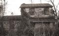
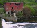
| 04/14/2005 07:48:18 AM |
Old Farm Houseby ace flymanComment: The contrast in this photo has made it look a little OoF. I also find that there is something blurry in the bottom right corner that is very distracting. Perhaps this building shot from a different angle would have done better for my vote. Good luck in this challenge. |
| Photographer found comment helpful. |
| 04/14/2005 07:44:36 AM |
The Apple Tree House circa mid 1700by graphicfunkComment: I'm not fond of the angle of this shot. I find it makes the photo look lop sided or unbalanced. The wires in the shot also are also very distracting and the photo generally looks more like a snap shot the a planned shot. Perhaps a more thought out subject would have scored better in this challenge. good luck in this challenge. |
| Photographer found comment helpful. |
| 04/14/2005 07:41:44 AM |
Old fort from 1897by angiedlComment: In my opinion this appears to me more like a ruin then an abandoned building. The photo itself looks a little OoF but that could be due to the contrast. I think it may have also looked better if the shot was from straight on(centered) and didn't lean to the right at the top of the photo. Good luck with this challenge. |
| Photographer found comment helpful. |
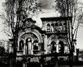
| 04/14/2005 07:35:52 AM |
The Mansionby vascComment: Nice interpretation of the challenge. I find the photo to be a little on the dark side and a bit to much USM. That is not a bad thing tho because I find it adds a certain uniqueness to this photo. The trees in the front are very distracting and altho the photo itself doesn't suggest abandoned it is above average from what I have seen in this challenge. I just noticed as well that it appears to be off level but that could be the angle of the shot. either way well done and good luck in this challenge. |
| Photographer found comment helpful. |
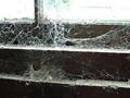
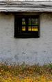
| 04/13/2005 10:31:51 AM |
Abandoned to spidersby SteveinnzComment: To me this photo doesn't suggest abandoned but dirty or neglected. I like the composition of the shot and it makes my eyes flow thru which is rare to see in a challenge. I also find the photo to be a bit on the bright side and could have been toned down a little. Good luck on this challenge. |
| Photographer found comment helpful. |
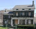
| 04/13/2005 10:28:46 AM |
Abandoned Memoriesby neenee1999Comment: Altho the landscape part of the photo is a little much I really like the building. Perhaps a tigher crop off the bottom and right side and increased the size of the building would have made for a more appealing photo. |
| Photographer found comment helpful. |
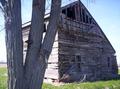
| 04/13/2005 10:26:02 AM |
Chicken Coopby avbowlerComment: In my opinion the flowers aren't needed and could have been cropped out. Also as it is there is nothing to suggest that this building is abandoned. |
| 04/13/2005 10:17:38 AM |
Run-down Run-throughby FalcComment: I'm not fond of this picture. It looks more like a bridge underpass and not a building which in my opinion doesn't meet the challenge. Altho the structure is very nice the runners are to distracting to get a feeling for the picture. I do like the B&W conversion tho as I think it adds to the age of the structure. Good luck in this challenge. |
| 04/13/2005 10:15:39 AM |
Oby Redstreak09Comment: In my opinion if you cropped off about 1.5-2 inches off the left side of the photo it would have made for a beter submission. As it looks, it looks kinda blown out from the contrast of the sun on the left side and loses a lot of clarity/definition in the rest of the photo. The tree in the foreground is not needed to make this photo and I find it to be very distracting. Good luck in this challenge. |
| Photographer found comment helpful. |
Home -
Challenges -
Community -
League -
Photos -
Cameras -
Lenses -
Learn -
Help -
Terms of Use -
Privacy -
Top ^
DPChallenge, and website content and design, Copyright © 2001-2025 Challenging Technologies, LLC.
All digital photo copyrights belong to the photographers and may not be used without permission.
Current Server Time: 08/11/2025 06:11:30 AM EDT.