| Image |
Comment |
| 04/14/2005 10:34:13 AM |
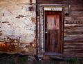
Once Homeby GolferDDSComment: personally there is nothing about this shot that would suggest the building is abandoned. It does look old but not abandoned. Perhaps a different view or angle could have improved this. It does have excellent colors and for the most part has clarity. Good luck in this challenge. |
 Photographer found comment helpful. Photographer found comment helpful. |
| 04/14/2005 10:32:18 AM |
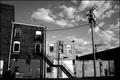
urban backyard of yesterday's pastby hollisterGqComment: Sorry but nothing in this photo suggests that the building is abandoned. The photo suggests vacant to me. The shadows on the building from the sun also make it hard to look at or are distracting. I do like the composition of the shot and the B&W conversion. Good luck in this chalenge. |
| Photographer found comment helpful. |
| 04/14/2005 10:30:14 AM |
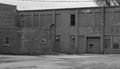
Last Lightby BudComment: The contrast of this photo has blown out most of the clarity o it could be from over processing it. I'm also not fond of the composition of the shot as it is just there and doesn't draw your eyes into the photo. Perhaps stepping back from the building a little bit to show a little more roof line would have made for a better photo. Good luck in this challenge. |
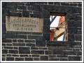
| 04/14/2005 10:28:20 AM |
236 Kansasby IronworkerComment: Perhaps titling it "school's closed" would have made for a better title. The photo is fairly nice and an excellent choice in B&W conversion. I really like the one window that isn't borded up. I find it adds a uniqueness to this photo. Well done and good luck in this challenge. |
| Photographer found comment helpful. |
| 04/14/2005 10:26:22 AM |
No more Fosters made here mate!by millsaComment: The photo as it is ould suggest a ruin not an abandoned building. I also find the angle of the shot to be off balanced which makes it hard to look at. Good luck in this challenge. |
| Photographer found comment helpful. |
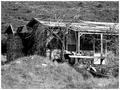
| 04/14/2005 10:24:08 AM |
Old watch houseby MoxyComment: To much zoom. From this far away the photo loses clarity. I also find that there is to much landscape in the photo altho is does tell a tale of what the building is about. I also like the composition of the photo and the way it draws my eye thru the photo ia the landscape. Well done and good luck in this challenge. |
| Photographer found comment helpful. |
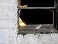
| 04/14/2005 10:21:11 AM |
Reflections Of What It Used To Beby AlainComment: Interesting take but I would have perfered to see more of the building. I think this photo would have done better in a windows challenge. I do however like the reflection of the sun in the galss and think it adds a certain uniqueness to the photo. Good luck in this challenge. |
| Photographer found comment helpful. |
| 04/14/2005 10:19:12 AM |
Goneby justineComment: A little to bright and a little to much contrast. I find it has blown out some of the details in the photo. The composition isn't bad as it does draw my eyes into the photo. Good luck in this challenge. |
| Photographer found comment helpful. |
| 04/14/2005 10:14:50 AM |
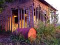
another useby slingshotComment: Excellent clarity and such vibrant colors with excellent composition. The building doesn't leave a lot to the imagination tho but it does draw the eyes tru the photo. Well done and good luck with this challenge. |
| Photographer found comment helpful. |
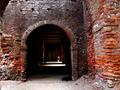
| 04/14/2005 10:13:33 AM |
bricksby imagesloyolaComment: In my opinon the photo looks OoF and the person in the background is very distracting. I'm also not fond of the building chosen for this challenge. Good luck. |
Home -
Challenges -
Community -
League -
Photos -
Cameras -
Lenses -
Learn -
Help -
Terms of Use -
Privacy -
Top ^
DPChallenge, and website content and design, Copyright © 2001-2025 Challenging Technologies, LLC.
All digital photo copyrights belong to the photographers and may not be used without permission.
Current Server Time: 08/11/2025 01:46:28 AM EDT.