| Image |
Comment |
| 07/16/2004 04:48:01 PM |
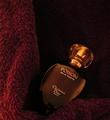
Dangerous Seductionby airaticComment: Hi Summer,
Greetings from the Critique Club...
Congrats on your personal best with this shot. I think all your many shots and selection of this one helped to get you a good ranking.
I think the size of your image (I'll take the word of ohmark who's done the math) is 50% smaller than it could/should be. When I vote I like to see as much detail and a larger image helps this. I think that's the main reason your shot was lower that in should be in the challenge. Read through some of the forums for the technical details of getting better sizes. As for the challenge fit, you nailed the feel of an advertisement.
As for the technical elements and the mood of the shot... The lighting on the bottle is just right-- the shadows and highlights could not have been better placed. You didn't put much technical detail in your comments but I assume part of your many shots was tweaking the lighting. I'd like to see the backdrop lit a little more on the right and less on the left. Playing around with two lamps/flashlight might make the lighting even more interesting.
You've got the right idea with the backdrop - right color that adds to the "romantic" feel -- there isn't much romance in terry cloth :) Silk/velvet, if you had it on hand would be better (I know you're working with what you've got) for the mood and to lessen a bit of distracting texture. Hard to tell but your dof looks spot on.
Looking forward to seeing more of your work in future challenges. If you have any questions, feel free to pm me.
Regards,
Theresa |
 Photographer found comment helpful. Photographer found comment helpful. |
| 07/16/2004 12:14:52 PM |
Free spirit by heidaComment: One of my ribbon picks - lovely pastel pallete, strong composition and excellent light. |
| Photographer found comment helpful. |
| 07/16/2004 09:30:04 AM |
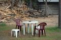
Let's eat out tonightby MotoCycleBoiComment: Greetings from the Critique Club...
I looked through your other entries and this one is quite different -- I guess based on the one comment you marked helpful that you were going for some humor in this entry - looks like not many got your meaning. :)
The compositional elements of the shot overshadowed your main subjects and didn't allow me to concentrate on the table/chairs/purple. The lighting is flat so it doesn't help you accent your vignette (and makes the purple muddy/brownish). The background is part of the reason for eating out but comes across as a separte element competing for "main subject" status vs. adding to the story.
Please pm me if you have any questions on my comments...
Regards,
Theresa |
| 07/15/2004 08:45:00 AM |
|
| 07/14/2004 09:28:34 AM |
|
| Photographer found comment helpful. |
| 07/14/2004 09:25:13 AM |
|
| 07/13/2004 07:12:36 PM |
|
| 07/13/2004 05:42:12 PM |
Freedomby sfarrell23Comment: couldn't afford a better pen :)))
Creative take on the theme, glasses and pen work well (seriously - you need a better pen or one without color/writing) border woks really well to set the monochromatic, "legal" mood. lighting and composition very good. |
| Photographer found comment helpful. |
| 07/13/2004 05:40:03 PM |
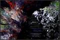
Escapeby pitsamanComment: nice twist on the theme, color in the walls adds interest, lighting just great. |
| Photographer found comment helpful. |
| 07/13/2004 05:38:56 PM |
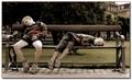
Cildhood Unboundby RoosterComment: their expressions couldn't be more different -- wish they were a bit sharper and the background tree was a bit more in the background. All in all nice capture. |
| Photographer found comment helpful. |
Home -
Challenges -
Community -
League -
Photos -
Cameras -
Lenses -
Learn -
Help -
Terms of Use -
Privacy -
Top ^
DPChallenge, and website content and design, Copyright © 2001-2025 Challenging Technologies, LLC.
All digital photo copyrights belong to the photographers and may not be used without permission.
Current Server Time: 08/26/2025 10:15:26 AM EDT.