| Image |
Comment |
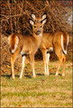
| 03/01/2012 09:23:30 AM |
Double deerby redpandaComment: Great composition, almost looks like the start of a deer totem pole. It works, and adds a lot of interest to an already great capture. I think you have an excellent photograph here and you should be pretty darned pleased with yourself. |
 Photographer found comment helpful. Photographer found comment helpful. |
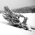
| 03/01/2012 09:18:37 AM |
Uprootedby goinskiingComment: I really, really like this shot and looked at it for quite a while. The composition is excellent, with the opposite angles of the roots and the hills behind. The snow is blown out and there isn't much detail there which sorta works, but I'm curious what a bit of detail might have done to the shot. The texture of the roots looks to be a little soft as well. Was this handheld? I'd love to see this one blown up as I think a much larger scale would enhance the beauty. Definitely not an easy shot to take outdoors in falling snow. |
| Photographer found comment helpful. |
| 03/01/2012 09:12:45 AM |
The bridgeby thorb59Comment: Very nice. Great composition, the bridge really pulls your eye in and leads you to the gorgeous parts of the sky. The only change I would have made is to make the bridge a bit sharper, I think a harder line would have been a great contrast to the soft sky. Understandably that might have been tricky to do with this setting and still get the soft water / sky. |
| Photographer found comment helpful. |
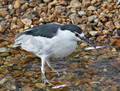
| 03/01/2012 09:09:47 AM |
Black-crowned Night Heron (Nycticorax nycticorax)by SteveJComment: Excellent detail, not only is the heron perfectly captured but the love the fish right below his foot. The coloring of the background makes the bird pop. About the only thing I would have changed is the crop. I would have done a tight crop of the left side to his body and added some additional space on the right side. Effectively moving the bulk of the bird out of the center of the shot, but putting his stunning head in a better place and really emphasizing the angle of his beak. |
| Photographer found comment helpful. |
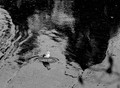
| 03/01/2012 09:05:41 AM |
Justby tnunComment: It works. It definitely works. The seagull is perfectly placed in the light part of the water, with the dark aspects complimenting that placement and he definitely draws your eye. I might have cropped the image a bit more to place the seagull a little more in the lines of the traditional rule of thirds (lower left section) because I think with this particular shot that rule would have applied quite well. (I don't often say that) |
| Photographer found comment helpful. |
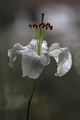
| 03/01/2012 09:02:07 AM |
Lily in the spotlightby eyestrangeComment: I like the composition, although I might have cropped a bit more at the top to make the flower less in the center. I also think it would have helped make the darker areas of the background in the upper left hand corner a little less distracting. The bit that is coming down in a point towards the flower is catching my eye and pulling my attention away from the flower, not what you want your background bokeh to do. |
| Photographer found comment helpful. |
| 03/01/2012 08:56:00 AM |
Curledby BrielleComment: This is a lovely photograph and something a little different than the average flower shot. I do wish that the focus of the picture (the green end of the petal) was just a tad sharper. |
| Photographer found comment helpful. |
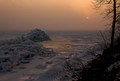
| 03/01/2012 08:54:22 AM |
Fire and Iceby IchristfollowerComment: The composition of this picture is really well done. The silhouette of the tree and ground, draws your eye to the subtle detail of the moon and from there it flows to the ice pile on the left. Basically your eye is drawn through the entire shot which means you are looking at it for a longer period of time. Great job! |
| Photographer found comment helpful. |
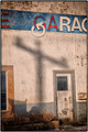
| 03/01/2012 08:52:10 AM |
Service Garageby flahermaComment: There are a few things a little off in this photograph in my opinion. It seems to be a little soft and a bit over-processed. I also think the composition needs some work as all the lines in the image are not working in harmony with the angle that you chose to take the photo at. A slight adjustment in your physical position would have made a big difference. i.e. the window on the left adds nothing at all to the image and is in fact distracting. I would have repositioned my body and adjusted my composition to create more impact. |
| Photographer found comment helpful. |
Home -
Challenges -
Community -
League -
Photos -
Cameras -
Lenses -
Learn -
Help -
Terms of Use -
Privacy -
Top ^
DPChallenge, and website content and design, Copyright © 2001-2025 Challenging Technologies, LLC.
All digital photo copyrights belong to the photographers and may not be used without permission.
Current Server Time: 08/23/2025 05:23:08 PM EDT.