|
|
|
Showing 201 - 210 of ~286 |
| Image |
Comment |
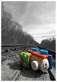
| 04/30/2006 06:01:51 PM | Derailedby LouisComment: Firstly, congrats on the personal best.
This is a brilliant photo. The clarity in the background, with Ansel Adams'-style b&W works really well against the bright colours of the train - special kudos when you remember its basic editing.
I think the selective desat works particularly well here because the background is not expected to be very colourful, and has a lot of texture.
Everything is crisp and sharp which is nice, and always helps to maximise a score here ;)
The slight tilt to it really adds to the atmosphere created - gives it character and supports the title/context. Composition is good, the negative space above seems to lend more weight to the sense of the converging lines 'disappearing' into the distance.
Creative idea for the challenge, very well executed. Nice and quirky, and you've not been tempted to over-saturate the coloured parts.
Not really sure of any criticism - maybe the railway building on the right gets in the way a little if I'm picky |  Photographer found comment helpful. Photographer found comment helpful. |
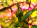
| 04/30/2006 05:08:47 PM | New life buddingby KelliComment: Before I start, lets be honest - this isn't really my kind of picture.
For a start, the composition is a bit dead with the bud right in centre. This is an occasion I'd recommend the rule of thirds, or a slight diagonal. Also, the colours are very garish, and the brightness of the background means that the bud - the main subject - doesn't stand out as much as it should, and the b/g is very distracting. The pink thorny bits are a bit too bright, and at this compression just look lke ompression artifacts/hot pixels or something similar.
This is my take of it - more muted colours, diff crop
 -crop, some slight cloning after rotation
-select background, create new layer via copy
-hue&saturation on b/g layer - saturation waaay down
-slight gaussian blur and lightening via levels on b/g
-levels on f/g
-much lower hue on reds, on all but top tufts on f/g, plus less lightness to keep the spikes visible
| | Photographer found comment helpful. |
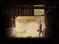
| 04/30/2006 04:40:01 PM | The Old Barn and Iby nards656Comment: to be honest, i was shocked when I scrolled down and saw the score - definitely underrated in my book. Its a good, understated self-portrait, strong atmosphere lent by the old barn, and challenge link right on spot. The darkness leading in to the brighter centre works well, but when you look at it more its clear it is underexposed at the far outside, and overexposed. As this was Advanced Editing, I would have thought you could rescue some of it, although the best approach would have been to combine 2 exposures (so obviously out-of-challenge), keeping the dark a nd lihght, but saving the extremes.
Having now read through the other comments, I disagree with the challenge-meeting part - this portrait is nothing without the context of the barn, it does exactly what the title says it will. Guess everyone else has their own opinions of course | | Photographer found comment helpful. |
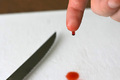
| 04/30/2006 04:21:22 PM | OUCH! Sharpby tngrndreamComment: well, its emotive - really made me wince. First, the lighting seems a little flat on the hand, making it a bit bland and flat which does give it an amateurish feel (though of course we ARE amateurs). However, the dof works really well with the OOF knife and stain giving context.
One simple thing which would have made it a lot neater is to have ensured that the white tissue in the background was consistent, without the stripe at the top. I think you could also have made it more dynamic a composition by experimenting with different positions of the main elements - atm all the action seems to be squished into the middle section.
As others have mentioned, the challenge link wasn't clear enough for some people. Although I'm never a fan of long titles to weasel inappropriate photos into challenges, you could have chosen a title to strengthen the (already existent) challenge link here, for example "fresh blood". | | Photographer found comment helpful. |
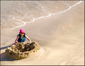
| 04/30/2006 04:06:16 PM | A New Castle Awaits the Coming Tideby chaliceComment: The positioning of the subject works well imho, with the diagonal of the sea making it more than just empty sand. Although I would personally give a tiny bit more negative space to the left, so its more bang on the third.
The noise doesn't detract overall, but it seems as though it makes the girl less crisp and clear - 400ISO seems a tad unnecessary if you're working with this light level.
Its nice how the brightly coloured subject pops out, but I think it could be made a lot stronger with just a little extra to echo this colour - maybe a bucket in the sand in front of the castle, or something, perhaps.
At first I thought this would have scored higher - maybe around 5.8 at least, but the link to the challenge isn't particularly dynamic whic hdoes bring it down aa little in my books. Its not that it dnmc or anything, but the link isn't 'wow'.
edit: just been looking through the other comments - I like ericwoo's approach with the sepia. Although the burst of colour is lost, it brings out more texture in the sand. Not sure which version I preferMessage edited by author 2006-04-30 16:08:50. | | Photographer found comment helpful. |
| 04/28/2006 10:57:43 AM | | | Photographer found comment helpful. |
| 04/23/2006 01:49:01 PM | Anatomy of a strikeby MelethiaComment: I love the originality of the idea, but the title perfects it. Nice composition, and exposure seems spot on.
Not too keen on the border, but 'tis not a big deal. | | Photographer found comment helpful. |
| 04/21/2006 02:17:00 PM | Candid_outtake2by DigiFotoBuddyComment: The backlighting's really nice on this one, as well as the converging diagonal formed by the path and height differences of the people. I'm not sure how it would have compared with your entry. | | Photographer found comment helpful. |
| 04/20/2006 12:36:21 PM | Storytime friendsby MattOComment: woah, i was surprised at the low score this got, its a nice composition and really cute. The toys do blend in with the b/g , like a1275 pointed out, but also it seems as though the focus on the child aint perfect. But overall I'm sure its underrated | | Photographer found comment helpful. |
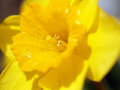
| 04/19/2006 06:07:02 PM | Spring colorsby MattOComment: I think the very shallow dof would work more effectively with a tighter crop, because as it is, the entire right half is oof, and the sharpest part, on the stamens, is bang on centre. Its difficult with daffodils, 'cause they can get kinda boring close up, just lots of yellow but maybe you could give it something else by harsher lighting, to bring out the textures Message edited by author 2006-04-20 12:31:04. | | Photographer found comment helpful. |
|
Showing 201 - 210 of ~286 |
Home -
Challenges -
Community -
League -
Photos -
Cameras -
Lenses -
Learn -
Prints! -
Help -
Terms of Use -
Privacy -
Top ^
DPChallenge, and website content and design, Copyright © 2001-2024 Challenging Technologies, LLC.
All digital photo copyrights belong to the photographers and may not be used without permission.
Current Server Time: 04/27/2024 04:13:10 AM EDT.
|