| Image |
Comment |
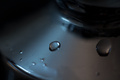
| 01/25/2012 01:21:43 PM |
On the "Cold" sideby randomcheeseComment: I really like the silver/black contrast. The center droplet is a bit fuzzy though. More glint on the water would have made a big difference. |
 Photographer found comment helpful. Photographer found comment helpful. |
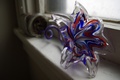
| 01/25/2012 01:19:44 PM |
Fallen Flowerby bflo_guyComment: cute. The colours could be more vibrant. It would work more for me if there was more dramatic perspective looking down the stem. The window sill kind of clutters it up too so maybe more of a clean background would be nice. |
| Photographer found comment helpful. |
| 01/25/2012 12:47:55 PM |
My Dinosaurby SEGComment: This is nice, I love the pattern of the scales/spikes esp on the chin. The lighting is a bit flat though. |
| Photographer found comment helpful. |
| 01/25/2012 12:45:48 PM |
|
| Photographer found comment helpful. |
| 01/25/2012 12:44:51 PM |
Goldsubby jacobfreckComment: I'd like this more if the lighting was shining off the thing that is in focus. Perhaps the whitepoint is too warm as well for the black and the wood |
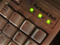
| 01/25/2012 12:41:41 PM |
All Greenby bobkComment: I have one of these keyboards in my basement lol.
I'm not sure what the focus here is...my eye isn't really drawn in to anywhere in particular. |
| 01/25/2012 12:39:06 PM |
Clockwork shadowsby filipthunbergComment: it's kinda flat...the colours don't pop, but it was a good opportunity since the rest of the photo is light. |
| Photographer found comment helpful. |
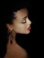
| 01/24/2012 05:22:08 PM |
The Bluesby JulietNNComment: very nice! This is gorgeous. The shadows on her face are subtle. The shoulder/back is a bit too blurred, and there's some jpeg-i-ness there too. |
| Photographer found comment helpful. |
| 01/24/2012 03:31:42 PM |
Bubbladiciousby JudiComment: nice lighting. I would give higher numbers if the fast-moving bubbles weren't blurry. I think it would have been more dramatic if you'd cropped the back half of the boy, and some off the top or bottom maybe.... |
| Photographer found comment helpful. |
| 01/24/2012 03:08:16 PM |
Hidingby nickybComment: a bit too cartoonish for me...too much clipping on both ends. |
| Photographer found comment helpful. |
Home -
Challenges -
Community -
League -
Photos -
Cameras -
Lenses -
Learn -
Help -
Terms of Use -
Privacy -
Top ^
DPChallenge, and website content and design, Copyright © 2001-2025 Challenging Technologies, LLC.
All digital photo copyrights belong to the photographers and may not be used without permission.
Current Server Time: 09/03/2025 02:51:18 AM EDT.