| Image |
Comment |
| 03/25/2004 11:34:49 PM |
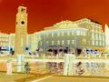
Hotel Sunby annapiComment: Turning it into a "negative" is not taking an interesting picture. Yes, there is a lot of orange, but it was no in the original. Try cropping more on the left to cut off the lonely spire edge and then add more of the tree to the right of the hotel. Score: 3 |
 Photographer found comment helpful. Photographer found comment helpful. |
| 03/25/2004 11:32:32 PM |
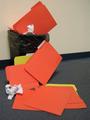
File 13by candycornComment: Erm...Nice idea, but too staged looking for not being in a studio. Perhaps try actually dropping them and see how they land. The overcompression of your file made it a bit blurry. I do like the off-set and not just centering the can. Perhaps boost the contrast to make everything brighter and make the wall whiter. Score: 3 |
| Photographer found comment helpful. |
| 03/25/2004 11:28:35 PM |
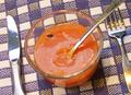
Love Potionby TommyMoe21Comment: Very, very red. I'm assuming you noticed this because you included "love" in your title and I have never seen that used in conjunction with orange before. I like the use of the black on red though and the combination works well. However the reflection on the glass is distracting. Score: 4 |
| 03/25/2004 11:26:51 PM |
Waiter, There's a fly in my soup!by Prof_FateComment: Blurry, bad reflections on the silverware. The whole spoon should be in the shot as well as the fork, or crop the fork closer to match the knife. The different lighting on the knife and fork is distracting. Score: 3 |
| Photographer found comment helpful. |
| 03/25/2004 11:24:00 PM |
A Lambo Among Othersby icemarnComment: Good use of DOF. However, this is clearly not orange as at the front of the car there is a painted on light which is orange whereas the rest of the car is red. Score: 4 |
| 03/25/2004 11:18:06 PM |
across the glassby xripollComment: Too small, yellow, and too bright of a reflection in the one spot, it's blinding! Interesting subject though. Score: 3 |
| 03/25/2004 11:16:14 PM |
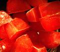
Iceby thumperComment: Orange/yellow reflections, but the majority of the picture is red. The metal bowl really distracts and the bright white spots on the left side do as well. If the whole background were black like the upper left corner and everything was sharper (not just the metal bowl in focus), the score would have been bumped up. Score: 3 |
| Photographer found comment helpful. |
| 03/25/2004 11:11:01 PM |
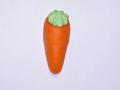
sweet carrotby PowerShot73Comment: Nice plain background. However: subject is centered which is uninteresting, the lighting is harsh, and there is nothing to make me want to score this highly at all. Score: 2 |
| 03/25/2004 11:09:23 PM |
Liquidateby asijComment: Turning it into a "negative" is not taking an interesting picture or an orange picture. It is pinkish-brown. Also, put the subject off to one side or the other, don't center it. I do like your use of the ripples though. Score: 3 |
| Photographer found comment helpful. |
| 03/25/2004 11:06:27 PM |
crazy stormby willsy66Comment: Turning it into a "negative" is not taking an interesting picture or an orange picture. Yes, it is a bit orangy, but more brown. Good sharpness on the tree an use of negative space, but bad pixelization in the sky. Score: 3 |
Home -
Challenges -
Community -
League -
Photos -
Cameras -
Lenses -
Learn -
Help -
Terms of Use -
Privacy -
Top ^
DPChallenge, and website content and design, Copyright © 2001-2025 Challenging Technologies, LLC.
All digital photo copyrights belong to the photographers and may not be used without permission.
Current Server Time: 08/02/2025 01:20:38 AM EDT.