| Image |
Comment |
| 06/25/2004 01:28:57 AM |
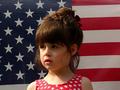
Small town gears up for July 4th festivitiesby neenee1999Comment: This goes in order of what comes to mind first:
1) Cute, but...
2) I'd like to see more expression, I just know that a smile would look adorable on her face, but why isn't there one?
3) It's obviously posed and it even could be but make something be happening, give it some life, have her look at the camera and connect with the reader.
4) Great clarity and sofness/sharpness.
Score: 5 |
 Photographer found comment helpful. Photographer found comment helpful. |
| 06/25/2004 01:04:46 AM |
The Art of Modern Danceby MadMordegonComment: In order of what comes to me first:
1) Great idea.
2) Great subject.
3) Too bright of a light. I don't like how over-exposed it is on the right or how it overwhelms the picture.
4) For a newspaper it would be best cropped to the dancers As it is it would work great for a magazine or advertisement.
5) I still really like it and it would have scored higher if it had met the challenge better.
Score: 6 |
| Photographer found comment helpful. |
| 06/24/2004 04:45:28 PM |
Autos: The Cost of Luxuryby airaticComment: This goes in order of what I notice first:
1) (First thing that ran through my head) What is that?? Okay, after looking, I get it.
a- A newspaper photo needs to be easily recognizable
b- It needs to focus on the specific subject of the article
2) It's too cluttered, for whatever you did (some sort of reflection?) it needed a plain background to make it clear.
3) Up the contrast some to bring out the silver in that Mercedes symbol, make it stand out!
Score: 4 |
| Photographer found comment helpful. |
| 06/23/2004 07:44:41 PM |
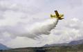
Making cloudsby vaguiloComment: This goes in order of what I notice first:
1) Needs a better title...it doesn't sound like a headline.
2) Crop to the plane and the cloud, we don't care about the mountains or the sky around it, just the bright yellow plane and the pretty white cloud it's dropping...
Score: 5 |
| Photographer found comment helpful. |
| 06/23/2004 07:25:39 PM |
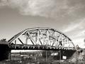
Bridge Demolishion Underwayby OneSweetSinComment: This goes in order of what I notice first:
1) For your title: give me a shot of that machine there on the far right and some beams or the sign on the fence with the bridge in the background. It's too general this way.
2) It's a newspaper photo...sepia?
3) Crop out the sky, why do we need it in a newspaper article about a bridge being demolished?
Score: 4 |
| 06/23/2004 07:22:55 PM |
Power Forwardby epeterandersonComment: This goes in order of what I notice first:
1) Great action shot.
2) Their faces are too dark. But since it was a candid capture, (at least it looks like it) then the only thing to do is work on it in photoshop to bring out their faces.
3) Crop it tighter to them, maybe eben to just from their hands and heads. The other boys really have nothing to do with the title so giving more direct focus on the determination in these two's faces would be great.
Score: 6 |
| 06/23/2004 07:17:20 PM |
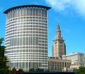
New county courthouse graces Cleveland skyline.by bobdaveantComment: This goes in order of what I notice first:
1) Which one is the courthouse? I'm assuming the one o the left, but it would be best if it were cropped to just that building, since that is the main topic...
2) Great colors, the blue is a great backdrop.
Score: 6 |
| Photographer found comment helpful. |
| 06/23/2004 07:15:30 PM |
|
| Photographer found comment helpful. |
| 06/23/2004 07:14:33 PM |
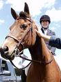
Charity Horse Show Names Grand Championby rmlutgenComment: This goes in order of what I notice first:
1) Random limb! Eeek, that's bad... and the tip of the horses nose is cut off...
2) Great great idea.
3) Try some contrast to add some deeper color to the horse and it's rider, it seems too pale.
4) Great expressions on both horse and rider, if the arm weren't there and the color were a bit better, this would be scoring higher, but sadly it hurts it.
Score: 7 |
| Photographer found comment helpful. |
| 06/23/2004 07:11:35 PM |
Man Chips Tooth - Sues for false advertising...by the-O-sterComment: This goes in order of what I notice first:
1) Um...what? The angle makes it too hard to notice what is on the sign right away, let alone read it.
2) Good DOF, but the background is still distracting because of the variedness.
3) Great colors, I like the vividness.
Score: 5 |
Home -
Challenges -
Community -
League -
Photos -
Cameras -
Lenses -
Learn -
Help -
Terms of Use -
Privacy -
Top ^
DPChallenge, and website content and design, Copyright © 2001-2025 Challenging Technologies, LLC.
All digital photo copyrights belong to the photographers and may not be used without permission.
Current Server Time: 08/02/2025 01:18:39 AM EDT.