| Image |
Comment |
| 09/09/2004 12:57:32 AM |
True Blacknessby AmiYuyComment: Thanks, Nick. The text was from a generic border I'd add when I'd post on Deviant Art and wanted to put a (c) thing but didn't want to put it on the photo...I didn't remove it before I uploaded it here. -_- Perhaps I will later...
And thank you Lori and Julia! |
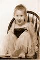
| 09/06/2004 03:07:51 AM |
Spriteby dartompkinsComment: I would have chosen a different pose and a different place to have her. I really would have liked to see this outside, but the blank wall works fine.
The sepia was a good idea because the original that you posted in the forums had waaay too much noise for it to be okay in color. Try a lower ISO next time. It's still distracting in this version as well.
You've got a great start there, it just needs some tweaking! |
 Photographer found comment helpful. Photographer found comment helpful. |
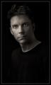
| 08/23/2004 01:10:31 AM |
Another Self Portraitby smokeditorComment: I like it. Perhaps some more light on the other side of your face or even just lighten up the whole picture...I'm missing the detail in your hair and the rest of your face. Maybe it's just personal preference, but I like "lighter" portraits. |
| Photographer found comment helpful. |
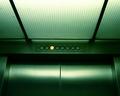
| 08/04/2004 02:36:09 PM |
Going Downby AmiYuyComment: Thanks everyone for your comments! It actually IS straight and not lopsided (try making your window not maximized and meet the sides of it with the doors and with the numbers...straight I say!), it was just hard to get it to even look this even from my original which was off center (I guess it needed to be perspective adjusted but you can't do that in basic editing).
Originally posted by Bassie:
I hope your score isn't "Going Down" Very unique photo. |
Yeah...it did, I kept wanting to comment in the forums about how my title was matching my score...although it went up from the last time I'd checked (5.0 Mon evening to 5.2 at the end). But it's still not as high as I'd hoped. |
| 06/28/2004 05:33:24 PM |
|
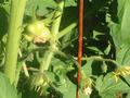
| 06/25/2004 01:59:13 AM |
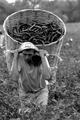
Immigrants' rights: A forgotten agendaby rameviComment: This goes in order of what I notice first:
1) I decided when I started voting/commenting that I wouldn't mention color vs. black and white...but I'm sorry, this picture just screamed COLOR to me. :(
2) Crop it more on the top and right side or even make it horizontal and crop it from his elbows to half of the basket.
3) Good lighting and contrast.
4) Good DOF.
Score: 6 |
| 06/25/2004 01:48:49 AM |
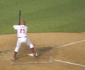
Thome Homers, Phils Win!by jmleliiComment: This goes in order of what I notice first:
1) Boost the colors a bit by adjusting the contrast, it seems really dull, although I know paper photos can be, they don't have to be.
2) Rotate a bit to make the line of the box parallel to the bottom edge, it just seems like he's ready to fall backwards.
Score: 5 |
| Photographer found comment helpful. |
| 06/25/2004 01:46:35 AM |
|
| Photographer found comment helpful. |
| 06/25/2004 01:45:32 AM |
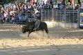
Rodeo Rides Into Townby Links 2 3 4Comment: This goes in order of what I notice first:
1) Crop to the bull and rider, we don't care about the crowd, we want to see action!
Score: 5 |
| Photographer found comment helpful. |
| 06/25/2004 01:40:54 AM |
|
Home -
Challenges -
Community -
League -
Photos -
Cameras -
Lenses -
Learn -
Help -
Terms of Use -
Privacy -
Top ^
DPChallenge, and website content and design, Copyright © 2001-2025 Challenging Technologies, LLC.
All digital photo copyrights belong to the photographers and may not be used without permission.
Current Server Time: 07/31/2025 06:46:39 PM EDT.