| Image |
Comment |
| 12/19/2003 08:24:05 PM |
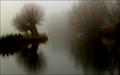
Waterlandby e301Comment: really seems like the horizon is titlted in this picture.. nice exposure, however - the water in the air is a nice touch =) |
 Photographer found comment helpful. Photographer found comment helpful. |
| 12/10/2003 05:37:30 PM |
Cheers!by MichaelsComment: nice picture, but the noise at the top seems a bit distracting.. without it, i could have seen this picture as a ribbon contender (although i'm not sure how valid my predictions are). i'm just wondering if neat image or something might have helped clear this up. |
| Photographer found comment helpful. |
| 12/10/2003 05:35:01 PM |
As Simple As ...by GeneralEComment: i like the choice of the rusted background, as opposed to the standard white or black - not exactly sure why, because it wouldn't necessarily work with all subjects. maybe it's the contrast of of the bubbly/colorful nature of the letters and the hard/aged look of the background. nice job. |
| Photographer found comment helpful. |
| 12/10/2003 05:30:46 PM |
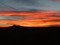
Sunset over Vulcanby linoserranoComment: because of the lack of detail in on the ground, it might have been nice to either include more of the sky or crop out more of the earth. the black tends to demand almost as much attention as the sky the way it is. |
| Photographer found comment helpful. |
| 12/10/2003 05:19:39 PM |
The Simple Lifeby GinaRothfelsComment: your subject looks more like a gardener than (what i believe you were trying to convey) a person simply taking care of their own garden. if this is indeed what you were going for, a different perspective (and pose+tool?) might have helped. if not, i guess i'm just confused! |
| Photographer found comment helpful. |
| 12/10/2003 05:15:08 PM |
Nothin' Simplerby goinskiingComment: tell me about it - during finals, this is my
edit: (have no idea why comment stopped like it did above)..
during finals, this is my savior/a common meal. Message edited by author 2003-12-21 23:41:46. |
| Photographer found comment helpful. |
| 12/10/2003 05:11:37 PM |
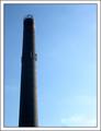
Hopeby ashleydangerComment: the border works well here.. and is that a smoke stack? intere |
| 12/10/2003 05:06:00 PM |
A Novice Monk: Simple Life or Simply a Kid?by librodoComment: if the wall continued further to the right, and this wasn't a candid, it might have been nice to move the kid over a little for a shot against just the wall. as it is, i still like the photo and title, but think that it would benefit tremendously from a more plain/uniform background. |
| Photographer found comment helpful. |
| 12/10/2003 04:58:32 PM |
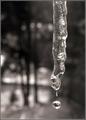
Here Comes the Sunby RoosterComment: if had you had the resources (maybe somebody patient enough to stand around while you were shooting), it would have been nice to place a solid background behind the icicle, for purpose of simplicity. the shallow dof helps keep attention on the icicle, but the background is still semi-distracting due to it's 'unsimple' nature. |
| Photographer found comment helpful. |
| 12/09/2003 04:17:24 PM |
just a hint...by tp-fcpComment: the border seems a bit distracting. i like the effort on the lighting to truly define the shape (i'm guessing a tea kettle?) of the object. |
| Photographer found comment helpful. |
Home -
Challenges -
Community -
League -
Photos -
Cameras -
Lenses -
Learn -
Help -
Terms of Use -
Privacy -
Top ^
DPChallenge, and website content and design, Copyright © 2001-2025 Challenging Technologies, LLC.
All digital photo copyrights belong to the photographers and may not be used without permission.
Current Server Time: 08/01/2025 01:45:19 AM EDT.