| Image |
Comment |
| 12/15/2004 04:15:27 AM |
Energyby TychoComment: may have preferred a slightly different angle (not sure why - perhaps would like more of a view of the last one?). texture and color is great, especially in the foreground. |
 Photographer found comment helpful. Photographer found comment helpful. |
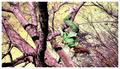
| 12/15/2004 03:47:21 AM |
one more dance for the birdby aznymComment: i know spot editing isn't allowed in these basic challenges, but i feel like the shadow on the right distracts slightly (although i think that leaving it there with this crop is more effective than if you had cropped it tighter) - really like the idea and use of shadows. |
| Photographer found comment helpful. |
| 12/15/2004 03:45:21 AM |
Christmas Breezeby echo68phComment: interesting and pleasant foreground, but would prefer a darker or slightly differently color balanced sky to accentuate the cloud (as well as look more natural) |
| Photographer found comment helpful. |
| 12/15/2004 03:44:38 AM |
Barking Into the Windby moswynComment: i don't mind the possible stretch to meet the challenge, but i feel that it is maybe just slightly more contrasty than i like. interesting choice on dof, and i guess a good choice considering that the rear end probably isn't farting in the wind ;0 |
| Photographer found comment helpful. |
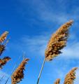
| 12/15/2004 03:42:27 AM |
so windyby HalimComment: slightly improved color rendition could help this image greatly, as well as a possible slight move to disclude the brances on the left. |
| 12/15/2004 03:41:39 AM |
In a Breezeby jessfrolioComment: while the motion blur does help convey the notion of wind, i feel that the sharpness at the center of the feather detracts slightly because it brings our focus into the center of the feather and away from the elements around it. in addition, the slight corner of gray in the upper right somewhat detracts from the otherwise pleasing and gentle white background. |
| Photographer found comment helpful. |
| 12/15/2004 03:33:58 AM |
Wind 'n Seaby MickComment: wow. and here i am sitting in my apartment. how sad. ;)
i love the human element in this photo - without it, would just be another attractive landscape/seascape shot. with it, adds a human/personal touch and makes it much more interesting. |
| Photographer found comment helpful. |
| 12/15/2004 03:32:37 AM |
Wind Blow, earth and skyby lytaComment: wow. at first i thought that those were some crazy looking trees.. guess they're just weeds/plants of some sort. nice perspective and colors (maybe a tad more yellow in the weeds? who knows) |
| Photographer found comment helpful. |
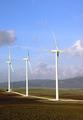
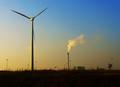
| 12/15/2004 03:31:34 AM |
Alternative Fuelby redmoonComment: simplistic, but good. if there were 2 windmills, i wouldn't like it nearly as much (although 10+ might be good too). aside from the basic editing rules, you might want to edit out that pole in the foreground as well as all the structures in the background.. might make for a very interesting image. |
| Photographer found comment helpful. |
| 12/15/2004 03:29:35 AM |
Windblownby nikon_girlComment: i don't usually like artificial appearances such as this, but this one catches my eye in an attractive way - perhaps because of the unique and dynamic angle, as well as the subdued hues (as opposed to the bright, overbearing saturation that often accompanies tweaked images) |
| Photographer found comment helpful. |
Home -
Challenges -
Community -
League -
Photos -
Cameras -
Lenses -
Learn -
Help -
Terms of Use -
Privacy -
Top ^
DPChallenge, and website content and design, Copyright © 2001-2025 Challenging Technologies, LLC.
All digital photo copyrights belong to the photographers and may not be used without permission.
Current Server Time: 08/04/2025 09:40:20 PM EDT.