| Image |
Comment |
| 08/06/2005 02:25:50 AM |
Room full of colors by terjeComment: Many congratulations - quite well deserved :)
I'm glad to see that a DPC Fanatics regular won the blue! Message edited by author 2005-08-06 02:26:19. |
 Photographer found comment helpful. Photographer found comment helpful. |
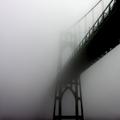
| 08/05/2005 04:02:59 PM |
Steel Ghostby MickComment: I agree - you got robbed! I like this much more than any of the ribboners, for sure. Beautiful. |
| Photographer found comment helpful. |
| 08/05/2005 02:45:31 PM |
Duotone2.jpgby sheapodComment: I agree that this is the best of the three. The whites are still white, and the blacks are still black. Perhaps a bit more contrast would work well here (and maybe a tighter crop?), but I do like the treatment. Good job. |
| Photographer found comment helpful. |
| 08/05/2005 02:42:55 PM |
Duotone3.jpgby sheapodComment: Same here - while it's certainly not a bad choice to duotone given the already black and white nature of the zebras - I think treatment may be a tad much in the blacks and whites. |
| Photographer found comment helpful. |
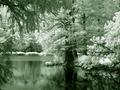
| 08/05/2005 02:41:21 PM |
Duotone.jpgby sheapodComment: I think the choice do duotone an IR shot is great - but I think the green might be a tad too extreme for my taste here. Even though we're doing duotone, I think I'd prefer to see the whites remain relatively white (and same with the blacks) rather than all turn to a greenish tint. |
| Photographer found comment helpful. |
| 08/03/2005 12:03:05 AM |
|
| Photographer found comment helpful. |
| 08/03/2005 12:01:57 AM |
Lifeline by NeilComment: Very nice - does the job and with simplicity, which is even better. Congratulations on 3rd :) |
| Photographer found comment helpful. |
| 08/03/2005 12:01:19 AM |
|
| Photographer found comment helpful. |
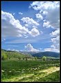
| 08/01/2005 03:23:25 PM |
Scenic Driveby justin_hewlettComment: Very nice clouds and a pretty landscape. As a means of improvement, I think that a larger center of interest could be used in the landscape in order to draw the viewer's attention. A very good effort :) |
| Photographer found comment helpful. |
| 08/01/2005 03:21:52 PM |
Tranquil Dawnby justin_hewlettComment: Very pretty, but a bit too blue for my taste. The blue saturation you have here carries over into the mountains, giving an unnatural feel to the shot. Perhaps if you did the same treatment again, but masked/reduced the effect on the mountains? |
| Photographer found comment helpful. |
Home -
Challenges -
Community -
League -
Photos -
Cameras -
Lenses -
Learn -
Help -
Terms of Use -
Privacy -
Top ^
DPChallenge, and website content and design, Copyright © 2001-2025 Challenging Technologies, LLC.
All digital photo copyrights belong to the photographers and may not be used without permission.
Current Server Time: 08/02/2025 05:15:49 AM EDT.