| Image |
Comment |
| 07/02/2005 02:32:02 AM |
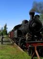
In the old daysby HoddssonComment: good line. i wish the smoke was following it into the image instead of drawing my attention off of the page |
 Photographer found comment helpful. Photographer found comment helpful. |
| 07/02/2005 01:37:57 AM |
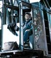
Blue Collarby blurredvisionComment: superb capture. I wish you had cropped down a bit more. the extraneous details on the right and bottom do grab too much attention. his expression says "ssdd"...i would have focused on that...would have given you that elusive top 10 |
| Photographer found comment helpful. |
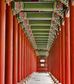
| 07/02/2005 12:58:06 AM |
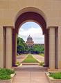
Through the Bell Towerby aimee_skittlesComment: great framing. i'm not sure how many people realized the almost perfect symmetry you created, but also that you left the shot very dynamic with the building jutting off to the right. That flag pole is extremely unfortunate, and i believe the culprit in the flatness you mentioned. the shot draws the eye in so well and then the flag pole stops it. it also distracts the curve of the dome, which would compliment your arches oh so well. i do believe you have an eye for shooting "great photos", unfortunately the situation and lighting doesn't always cooperate. If you can't wait, Photoshop will help if you let it. Message edited by author 2005-07-02 01:02:40. |
| Photographer found comment helpful. |
| 06/30/2005 12:29:31 AM |
|
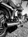
| 06/28/2005 03:55:35 PM |
Pipes in the Sunby neophyteComment: clean and crisp. almost too crisp as the background and grass are a bit distracting. you seem to have gone half-way with the shot. your too close to enjoy the whole bike but not close enoth to enjoy an abstract of leading lines. i'm wondering what it would have looked like with the camera right up against the pipe looking down toward the front wheel (if possible turned out to see the rim) |
| Photographer found comment helpful. |
| 06/28/2005 03:50:51 PM |
Window to the outside world.by docpjvComment: good idea. i wish the ceiling and ground complimented each other better. i'm wondering if you turned this photo upside down whether it would have more visual impact. |
| Photographer found comment helpful. |
| 06/28/2005 03:48:09 PM |
Modern Day Castleby Prime_TimeComment: as you might have gotten already...the border is a bit distracting. i'm guessing you were going for sort of looking out the ramparts but i'm not sure it worked. otherwise the lines of the structure are very pleasing. there could be a bit more contrast for my liking. |
| Photographer found comment helpful. |
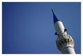
| 06/28/2005 03:44:13 PM |
Sky Linesby MikeOComment: super crisp, good lighting. like the blues. composition is just lacking excitement for me |
| Photographer found comment helpful. |
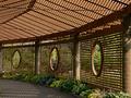
| 06/28/2005 03:42:30 PM |
Botanical Discoveryby notbiscuitComment: lots of lines here. unfortunately those center columns seem to block the movement you're trying to create. i wish you had found a nice focal point, perhaps some flowers and found a line leading to them...perhaps some of the shadows created by these lines would have done the trick. |
| Photographer found comment helpful. |
| 06/28/2005 03:39:50 PM |
Baseline Runnersby whatdewucComment: nice motion. i would have gone with one or the other child, and i would have erred on the side of cute. It looks like your bg is overexposed and you magnified the problem by having to dodge the trees to make the kids stand out. next time try a very wide aperture if your camera allows it to blur out the bg details |
| Photographer found comment helpful. |
Home -
Challenges -
Community -
League -
Photos -
Cameras -
Lenses -
Learn -
Help -
Terms of Use -
Privacy -
Top ^
DPChallenge, and website content and design, Copyright © 2001-2025 Challenging Technologies, LLC.
All digital photo copyrights belong to the photographers and may not be used without permission.
Current Server Time: 08/04/2025 10:02:54 PM EDT.