| Image |
Comment |
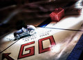
| 07/29/2011 01:04:21 PM |
GOby colorcarnivalComment: Wonderful nostalgia piece. The light in the background gives a ghostly sense of movement, whereas in the foreground creates a path of the car. All items, the board, the car, the house, are all obviously stationary, but the use of light gives a sense of movement to them all. I even love the house/hotel piece, which looks like a faded memory. |
 Photographer found comment helpful. Photographer found comment helpful. |
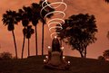
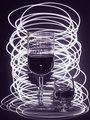
| 07/29/2011 01:04:17 PM |
Energy vortexby tunnelvisionComment: Interesting piece, my only nitpick is the light looses it's three-dimensionality at the very top- it looks like the vortex bends backwards the 2 loop from the top. |
| Photographer found comment helpful. |
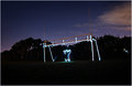
| 07/29/2011 01:04:15 PM |
Soccer anyone?by mbrutus2009Comment: I think this would be more interesting, if instead of the goalpost being illuminated, that instead there would be a bouncing light coming from outside the left frame to the goalie, so it looks like the path of a soccer ball being blocked at the last minute. |
| Photographer found comment helpful. |
| 07/29/2011 01:04:11 PM |
do not ask what is itby posthumousComment: If there was a difference of texture (light of grass and then bush/tree) or a play on sharpening focus of an area and defocussing on other areas could help create a more interesting piece. Also, if you have two people in interesting positions, and light them from behind with a stronger light, the shadows on the grass could look like the shadows of monsters creeping in the night. |
| Photographer found comment helpful. |
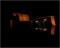
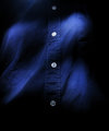
| 07/29/2011 01:04:10 PM |
Ukeby LN13Comment: I love how the angle of the lighting gives the bare minimum detail. I can definitely tell it is an uke with the detail given, but the shapes made from the light itself are interesting on their own. The wood portion looks so clean with unbroken slopes that if the guitar strings were wound slightly cleaner then it would have a more modern feel. |
| Photographer found comment helpful. |
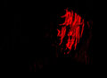
| 07/29/2011 01:04:07 PM |
Face on fire...by sinistral_leoComment: Cropping out (not all) some of the blackness to the left of the face would bring more attention to the face itself. It would also disrupt the balance of 50%black, 50%with light, which tends to make the eye focus more on the art piece. |
| Photographer found comment helpful. |
| 07/29/2011 01:03:59 PM |
|
| Photographer found comment helpful. |
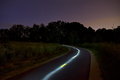
| 07/29/2011 01:03:55 PM |
Pathway to Darknessby giantmikeComment: Looks like the light of a ghost motorcycle. Cropping out the bear branches of the right side (distracts from the piece) would make this a pretty awesome post-card of a road trip. |
| Photographer found comment helpful. |
| 07/29/2011 01:03:51 PM |
Tipsyby tvsometimeComment: Would be more tipsy if the lights were tipped on either one angle or another, to give a sense of wobblyness. |
| Photographer found comment helpful. |
| 07/29/2011 01:03:48 PM |
|
| Photographer found comment helpful. |
Home -
Challenges -
Community -
League -
Photos -
Cameras -
Lenses -
Learn -
Help -
Terms of Use -
Privacy -
Top ^
DPChallenge, and website content and design, Copyright © 2001-2025 Challenging Technologies, LLC.
All digital photo copyrights belong to the photographers and may not be used without permission.
Current Server Time: 08/21/2025 11:14:47 AM EDT.