| Image |
Comment |
| 01/25/2012 11:15:01 PM |
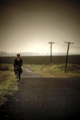
GriEVE by Lizzie Wilcockby JudiComment: Extremely impressive use of DOF and vignette. It reminds me of The Road by McCarthy...it has that sort of apocalyptic feel with the tattered clothes and near desolate landscape. Wonderful photograph. :) |
 Photographer found comment helpful. Photographer found comment helpful. |
| 01/24/2012 09:53:18 PM |
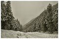
Snow Falling on Cedarsby bdshortComment: Excellent detail and the subtle feeling that this is a painting really sets this photo apart. Love it. :D |
| 01/24/2012 09:52:33 PM |
|
| Photographer found comment helpful. |
| 01/24/2012 08:11:28 PM |
|
| Photographer found comment helpful. |
| 01/24/2012 11:40:35 AM |
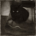
by messerschmittComment: Absolutely gorgeous. Love the grunge border and stunning, illuminating eyes. |
| Photographer found comment helpful. |
| 01/24/2012 10:44:05 AM |
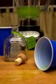
Thanks for the memories...by bargleComment: Your main focus is clearly the bottom of the image. You have a lot of nice lines leading to the spilled beverage, however, that spill is also pushing my eyes out of the image. I like the subtle reflection of the tequila bottle in the spill, it may have been advantageous to play on that a little more. I think the background (upwards of the tequila bottle) is a bit distracting and doesn't have a main focus. Yes I understand the blender, but even behind the blender has a lot of geometry that doesn't add, but even distracts from your main focus.
The image is a bit cramped and doesn't convey partying to me; it conveys more of a personal, one-man party. However, I think the theme was a good shot. |
| 01/22/2012 09:02:14 PM |
Honey? Don't throw the visible light spectrum in the garbage. It's recyclable. =-)by fas-ligandComment: Actually, this idea has striking potential to me! However, the execution is falling flat. I think the blue tarp/bag on the top of the screen is supposed to be a garbage receptacle...unfortunately it's really not obvious upon first looking. The half hand on the bottom right unsettles the image. I think a direct downward shot would have had much more promise. In addition to a more clear presentation of the garbage can/bag, I also feel that the fresh cut vegetables aren't..."garbagey" enough, trashing it up and blending them more together to create a more cohesive visible spectrum would have more effect in my opinion. A very good idea though. :) |
| Photographer found comment helpful. |
| 01/22/2012 08:56:23 PM |
I thought they said "bread"by genova24Comment: I like this image. I think you definitely stepped out of the box in finding a unique subject for the challenge. Unfortunately it didn't pay off too well in the challenge. :\
My impression is that the ball is too centered (or even not enough centered) and too small in the frame to generate the interest you want. I do like the texture that the mosaic generates in your background, but there's just something missing from the image. Maybe it's a story...or a general direction. When I look at it, my eyes aren't directed anywhere. In fact, the arms of Jesus tend to draw my eyes out the top of the image. I think a harder look at the subject would generate a more compelling image. |
| Photographer found comment helpful. |
| 01/15/2012 08:11:17 PM |
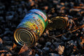
Sweet Cornby markwileyComment: This photo is truly beautiful. I love the gentle crisp of the leaves and how that texture is transferred to the dirt on the can. The color on the can in contrast with the blues of the shadows really pops. |
| Photographer found comment helpful. |
| 09/22/2011 10:41:39 AM |
|
Home -
Challenges -
Community -
League -
Photos -
Cameras -
Lenses -
Learn -
Help -
Terms of Use -
Privacy -
Top ^
DPChallenge, and website content and design, Copyright © 2001-2025 Challenging Technologies, LLC.
All digital photo copyrights belong to the photographers and may not be used without permission.
Current Server Time: 09/02/2025 11:14:53 PM EDT.