| Image |
Comment |
| 05/10/2011 05:15:18 PM |
|
 Photographer found comment helpful. Photographer found comment helpful. |
| 05/10/2011 05:10:15 PM |
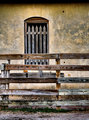
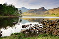
Beyond Repairby SaraRComment: Wonderful image, makes me wonder why the heck I'm sitting here instead of fishing:-). |
| Photographer found comment helpful. |
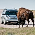
| 05/10/2011 05:03:39 PM |
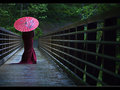
Behind The Fenceby gsalComment: I believe this photo would have been stronger if she had been in sharp focus and the fence OOF, as it is this is way to busy to my eye. |
| Photographer found comment helpful. |
| 05/10/2011 05:00:43 PM |
Safe Crossing by njsabsComment: Great photo, beautiful colors, subdued. The bare ground on the far side of the bridge right over the railing distracts my eye just a tad, maybe the viewpoint could have been lowered 12", but I'm nitpicking here. |
| Photographer found comment helpful. |
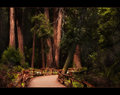
| 05/10/2011 04:53:13 PM |
Crossing Overby HipychikComment: Something about this photo draws me in, I'm not sure what it is but it's a great shot. |
| Photographer found comment helpful. |
| 05/10/2011 04:48:24 PM |
|
| Photographer found comment helpful. |
| 05/09/2011 07:05:52 AM |
Make my day!by EaglerapidsComment: Crowis, is your monitor calibrated? The sky here certainly isn't a deep dark blue but it isn't blown out, at least on my monitor, I edited the pic and I see a light blue but not white sky. |
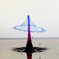
| 05/08/2011 10:44:07 AM |
Red & Blue dropby enizmonComment: I'm still new here so I haven't seen all the water drops you guys speak of and I'm really impressed with this shot, gorgeous. I feel it should have placed much higher. |
| Photographer found comment helpful. |
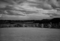
| 05/06/2011 07:28:07 PM |
Sydney Parkby daisydavidComment: I'm a noob to this site but if I may make an observation. The sky is a very strong element of this composition and is beautiful but the foreground, the big expanse of grass, is not. The horizon is very close to the center, weakening the composition. My suggestion would be to crop the foreground almost up to the first line of trees. This would give the sky much greater weight and strengthen the whole. This would also give the photo a panorama type look which I feel would look good. A 16X10 aspect ratio can be quite nice.
:-) Message edited by author 2011-05-06 19:30:53. |
| Photographer found comment helpful. |
| 05/06/2011 04:57:52 PM |
All Mine!!! by Shutter-For-HireComment: I have to be honest here. I rated this picture low because when I first saw it I disliked it immediately. The subject looked so greedy I was turned off the whole picture. When I saw that it had won, I looked at it with new eyes and started to appreciate the technical expertise required to shoot the photo and began to realize the power of the photo. It conveys it's subject extremely well, so well that I still don't like the photo! If I can ever take a photo that is half as powerful as this I will be happy.
Great job Shutter-For-Hire. |
| Photographer found comment helpful. |
Home -
Challenges -
Community -
League -
Photos -
Cameras -
Lenses -
Learn -
Help -
Terms of Use -
Privacy -
Top ^
DPChallenge, and website content and design, Copyright © 2001-2025 Challenging Technologies, LLC.
All digital photo copyrights belong to the photographers and may not be used without permission.
Current Server Time: 08/02/2025 07:45:47 AM EDT.