| Image |
Comment |
| 03/30/2011 08:02:10 PM |
What a sunny day!by havenComment: Took me a little bit of time to realize it was a razor I was looking at and not some obscure camera equipment. It's a cute shot, nice title. The green basket seems out of place, but the harsh sunlight works conceptually. |
 Photographer found comment helpful. Photographer found comment helpful. |
| 03/30/2011 07:59:44 PM |
Cracked Openby Jon_HComment: I am extremely curious about what that black bar in the reflection is. It's extremely distracting, it keeps causing my eye to drift to it. The form of this is good, I like it in the right plane as opposed to the left, and the thin shell membrane is the perfect amount of "not perfect." It makes me identify with it as hair, and makes the yolk remind me of a princess. (yeah, I bet you didn't expect that one.) Exposure seems mostly good, it's a bit bright for me on the right side. |
| Photographer found comment helpful. |
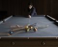
| 03/30/2011 07:56:25 PM |
Break!by nickybComment: A nice surprise when it came on the screen. I didn't see it in thumbnail mode. Implied action in this is nice. I wish you could have gotten the pool cue sharp in there somehow. Composition is mostl nice. To make the shot perfect (compositionally) the middle white diamond, the orange 3 ball, and the male would have ideally lined up. Lighting in the bottom of the image is nice, the wall and the male seem to be a little bit dark. I would have liked to see the dark object in the left corner to be gone, and maybe some way to frame this, a vignette possibly? |
| Photographer found comment helpful. |
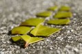
| 03/30/2011 07:52:23 PM |
Broken Leafby blueblossom11Comment: I was more excited for this one when I saw it in the thumbnail view. I'm not sure what is lost in the translation to full size, but I suspect it lies within the background. The shape is dynamic and leads you well through the image, and I like the focus where you chose it. The leaf color is a little bit drab, but I like how you dissected it. Overall not bad, it just doesn't create a lasting impression on me. It's one of those shots where I'd be inclined to say "Oh, I get it." and move on. 6 |
| Photographer found comment helpful. |
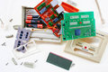
| 03/30/2011 07:47:16 PM |
Caller ID Systemby aurorabComment: I don't mind the cropping on this one. It's busy, but it still feels like there's a little bit of room to breath. It feels random, but at the same time deliberate. "real" if you will. With that said. the lighting feels a bit harsh. The subtle white on white is lost in the glare of the light source. I like the audio plug on the left, it helps to tell a story, but the plug on the right seems out of place, like both ends of the line came out when it "fell." The color cast on the batteries seems a bit strange. the copper is really red, I'm not sure why that is. |
| Photographer found comment helpful. |
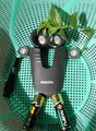
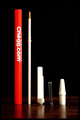
| 03/30/2011 07:42:26 PM |
Chegg!by JustinMComment: I like the surface texture that was used, and the hierarchy of components. I feel like the image is a bit blown out, and loses some of the subtle shadows that could occur. |
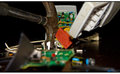
| 03/30/2011 07:40:26 PM |
Hammeringby StickInMindComment: Other than a hammer, I'm not really sure what it is I'm looking at. The in-focus part (hammer +red cloth?) don't seem to give much clues. Because the red is in the center of the frame, and such a strong color (partially because its red, and partially because its not used much in the photo anywhere else) it steals the importance away from the rest of the image. It's a very busy image, and my eye doesn't really know where to go once it sees red in-focus area. |
| Photographer found comment helpful. |
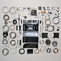
| 03/30/2011 07:36:38 PM |
Yashica Minister III Repair: Part Oneby BrennanOBComment: The first thing that struck me about this was the cropping difference between the top and bottom, and the left and right sides. It feels a bit dim, and the hard shadows casting on other objects probably doesn't help.
In some of the other mass- disassembled shots, it seems like there are a lot more unique parts. This camera has so many round components, I wonder if there's a way to exploit that and create a more unique "grid" of parts. |
| Photographer found comment helpful. |
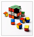
| 03/30/2011 07:32:42 PM |
Cheating the Cubeby OllyDComment: Good technical shot. Wouldn't surprise me if this was a ribbon contender. The color reflections in the shadows are nice, the exposure is spot on, and the DOF and hierarchy both creating an interesting focal point to rest on.
The little quirks, like the cube being ever-so-slightly rotated at points only add to the authenticity.
It works well for this challenge. |
| Photographer found comment helpful. |
| 03/30/2011 07:29:25 PM |
Dinner Disassembledby expatdawnComment: The first thing I noticed in this is how strongly colored the light source is. I think this could use a little more white balance, even if you do still want to keep it warm toned. The DOF for me is a bit strange, it kind of took me a while to find the area of the photograph that's in focus. I kept expecting it to be the egg on the left. With that said, I think if you positioned some things farther back to accentuate the Yolk it would be helpful. (this would be in reference to the egg crate, mustard and mayo). In this regard, everything seems to be in the same plane of vision, almost a horizontal line, and that also seems to assist in making the hierarchy a little difficult to establish. |
| Photographer found comment helpful. |
Home -
Challenges -
Community -
League -
Photos -
Cameras -
Lenses -
Learn -
Help -
Terms of Use -
Privacy -
Top ^
DPChallenge, and website content and design, Copyright © 2001-2025 Challenging Technologies, LLC.
All digital photo copyrights belong to the photographers and may not be used without permission.
Current Server Time: 08/04/2025 11:07:49 AM EDT.