|
|
|
Showing 311 - 320 of ~433 |
| Image |
Comment |
| 03/30/2011 08:41:28 PM | Pistil of the chrysanthemumby liangdaweiComment: I see what you were trying to imply, but it doesn't quite work with this challenge IMO. Flower tendrils separating on their own seems like a stretch to "disassembled," a word that implies the human touch.
with that said, focus seems good, nice and sharp where you want it to be. I would have liked this to have some more symmetry, the slight angle it leans to seems distracting. The color looks good filling the frame, but it seems a bit unnatural. The little spec of a stem in the bottom right corner should probably be cropped out. |
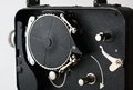
| 03/30/2011 08:36:38 PM | cine kodak eightby jgoingsComment: oooh, pretty.
Nice lighting, crop is good (more up top please, 20px more), texture is great to look at. Exposure is great. love the arrow and the implied sense of motion.
biggest gripe is that I don't necessarily feel "disassembled". It's kind of like taking the lid off a piece of tupperware and shooting the food inside.
anyway, 8/10. I'm sure you'll do well in this challenge. |  Photographer found comment helpful. Photographer found comment helpful. |
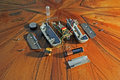
| 03/30/2011 08:33:46 PM | I don't know what this is...but I took it apartby ferrissComment: How dare you take apart an electromagnetic wobbler alarm coil, don't you know how rare those are?
This image feels a bit strange on a few levels. the floor is really distracting. it has some lines that lead you to the parts, but the parts are all at a strange angle to these lines. On top of that, the color of the floor is really overwhelming with the muted tones of the electronics. It's fighting heavily to be the focal point. This is further accentuated by the loose cropping on all the sides. You also get some strange reflections by keeping the cropping loose.
The shadows in this are really long and hard (thatswhatshesaid), and when combined with the dark grain of the wood, they kind of combine to draw you back into the background. | | Photographer found comment helpful. |
| 03/30/2011 08:28:01 PM | Johnny Five, No Longer Alive.by chazoeComment: I don't get the title reference.
My biggest qualm with this is that it's so close that I don't know that something is actually disassembled. With an exception to the lens, I feel like if I stuck my lens down a motherboard, it would have a similar look. It's a bit cramped, and crowded, and the lens isn't a very interesting focal point, although you did isolate it very well with the DOF. I wish there were some leading lines, or something to help me navigate around the image, at this point, I see an infocus lens, and some shiny metal, but there's not enough other things to stick around and enjoy. | | Photographer found comment helpful. |
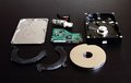
| 03/30/2011 08:22:52 PM | Open the box and your memories are gone foreverby InsideComment: interesting perspective and background texture. I don't really care much for the harddrive case resting on the mirrored surface, it breaks the continuous expected edge which makes my eye keep jumping back to that location. With the minute color in this, I'm curious what it'd look like in B&W. | | Photographer found comment helpful. |
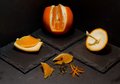
| 03/30/2011 08:19:47 PM | Disassembled orangeby kb4553Comment: an orange was actually my first idea for this challenge. I wanted to separate all the skin, the pulp, the seeds, stem, as far down as I could break it.
In this image: the leading lines of the bricks lead to the main orange, but the main orange seems a bit dark and underexposed, especially with the contrast of the pulpy pieces on either side of it. The big square line where you stopped cutting the peel seems unnatural. I wish it would have ended at a point or underneath. The orange slices not on the bricks seem distracting. they're not as formally interesting, and come off as sloppy in the otherwise very clean shot. | | Photographer found comment helpful. |
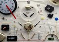
| 03/30/2011 08:15:19 PM | Abstract Timeby onepurpleroseComment: the white furry rug reminded me immediately of alice in wonderland. I think this could have made a good reference to that, both due to it's activeness, and strangeness. I like the crop, using the full image frame was good, and the objects are dynamic, there's a lot of paths my eye can take without stopping on any one thing in particular.
on a more formal level, the single light source cause a highlight at the top, and a shadow at the bottom, along with casting a shadow on the clocks face (important IMO). I would have liked to have seen less wrinkles in the rug, and just a tad bit more exposure. Good Job. | | Photographer found comment helpful. |
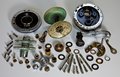
| 03/30/2011 08:11:57 PM | Fishing Reel Deconstructedby franktheyankComment: Lots of nice shapes and colors. I wish that you would have exploited the textures just a bit more. It's *almost* a straight up and down shot, but the perspective on it makes it feel like things are unstable or falling, rather than floating. I think I would have like to have seen this exposed a with another light as well, the background seems a bit dark, along with the shadows. | | Photographer found comment helpful. |
| 03/30/2011 08:08:47 PM | Love Me, Loves Me Not, Loves Me....Stupid Flowerby aj1621Comment: good dynamic, doesn't feel flat. The middle flower pedal is a great focal point, and the perfect angle. The stem of the flower feels a bit overlooked and sickly. maybe a bit of green saturation would help. DOF isn't bad, but I think I'd prefer the stem to be just a little bit more in focus, maybe one stop up. | | Photographer found comment helpful. |
| 03/30/2011 08:05:58 PM | I immediately regret this decision!! by mileskeaComment: I'm not a big fan of the reflection in this one, it takes away from the elegance of the parts and turns it into a jumbled pile... which would go well with the title, but since everything is displayed so thoughtfully, I find it distracting. Exposure seems good, there's a few weird blue highlights (window?tv?) and there's a fair amount of highly visible dust on the mirrored surface. I wiped at my monitor for it. The crop on the left seems weird because of the other 3 sides untouched, feels accidental. | | Photographer found comment helpful. |
|
Showing 311 - 320 of ~433 |
Home -
Challenges -
Community -
League -
Photos -
Cameras -
Lenses -
Learn -
Help -
Terms of Use -
Privacy -
Top ^
DPChallenge, and website content and design, Copyright © 2001-2025 Challenging Technologies, LLC.
All digital photo copyrights belong to the photographers and may not be used without permission.
Current Server Time: 08/04/2025 01:42:41 PM EDT.
|