| Image |
Comment |
| 06/24/2006 11:19:02 AM |
kidsbehinddoor.JPGby lizzyc3Comment: Love the little boy's mischievous grin and how it appears he's peering from around the door. Unfortunately, the lighting really ruined this for you though... |
| 06/24/2006 11:17:46 AM |
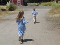
kidsrunning.JPGby lizzyc3Comment: The heavy shadows are distracting. I don't care for the background. My very first thought was, "Oh my, they are running into the road!" After looking closer I see it may be a parking area...but still not a good place for children to run. With children, it would have working better maybe on a wooded path, a playground, or something more fitting. |
| 06/24/2006 11:15:55 AM |
michael.JPGby lizzyc3Comment: Not too bad. I would have liked him turn slight more towards the camera so it wasn't too much of a profile view. Lighting isn't bad either. Processing seems a little heavy for me...quite dark, almost black, on the edges making it look like he's got a spotlight on him. |
| 06/24/2006 11:14:18 AM |
michaellaughing.JPGby lizzyc3Comment: Cute boy and smile. The motion blur in his hand are distracting. Nice light in his eyes. As a tip, when you have someone looking, walking, etc. in a certain direction, keep the extra white/negative space to the side they are going. Here you have extra space on the left...it should go on the right so he has room to look. Instead the edge of the image is cutting too close. |
| 06/24/2006 11:10:11 AM |
mom&katie.JPGby lizzyc3Comment: Washed out and maybe a little soft. I don't care for the pose. The mom's fash is turned away from the camera and half the little girls face is behind the mom's. I think the pose would have worked if you were more to the right. For an intimate pose like this, zoom in and get close. It's not about the fence and tress, it's about mom and daugther. Composing tighter will eliminate the unnecessary. |
| 06/24/2006 11:08:09 AM |
cuteholdinghands.JPGby lizzyc3Comment: As said, the lighting is very harsh. It's washing out your color. The background isn't too appealing. Looks like dead grass/brush? Try a shady, overcast day or use fill-flash. |
| 05/29/2006 12:17:19 PM |
|
 Photographer found comment helpful. Photographer found comment helpful. |
| 03/18/2006 01:32:32 PM |
|
| Photographer found comment helpful. |
| 03/03/2006 06:45:23 PM |
|
| Photographer found comment helpful. |
| 03/01/2006 07:04:48 PM |
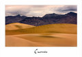
Curvesby gaurawaComment: I think this one is absolutely beautiful, too. My second fave, I think. I actually like the lack of shadows because it seems like 'every' sand dune we see has them. This is different and I like it just the way it is. |
| Photographer found comment helpful. |
Home -
Challenges -
Community -
League -
Photos -
Cameras -
Lenses -
Learn -
Help -
Terms of Use -
Privacy -
Top ^
DPChallenge, and website content and design, Copyright © 2001-2025 Challenging Technologies, LLC.
All digital photo copyrights belong to the photographers and may not be used without permission.
Current Server Time: 07/30/2025 10:45:58 AM EDT.