| Image |
Comment |
| 08/11/2002 08:11:00 PM |
Violinby cq107Comment: This image has several elements that I find appealing. First and foremost is wood....I love earthy elements like wood and pottery. The wood here is nicely grained and has nice warm tones. Curves are another element I savor and curves are abundant here. The third aspect I like is the diagonal angle. Add all that to my love of music, which this represents so well, and the cropping is good. I like the dark/black background. Lovely picture, uncluttered...wonderful job! |
| 08/11/2002 04:59:00 PM |
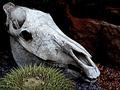
ancient fossilby magnetic9999Comment: I love the composition but it looks kinda shiny to be a fossil. It looks more like a casting of a fossil. I really do like it a lot though. |
| 07/31/2002 05:19:00 PM |
|
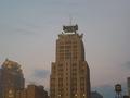
| 07/31/2002 08:49:00 PM |
Corporate Skylineby wargloryComment: It shows me there house, but tells me nothing more about "Corporate World." Nevertheless it is a certain appealing with it's strong graphical lines. My favorite part being the water tower in the distance....I'd like to see the sky have a little more character to add to the scenario. |
| 07/31/2002 04:44:00 PM |
Open the gate for a Bull Marketby Frank BeckmanComment: Title and picture correlate well. I love the colors. The out-of-focus foliage on the right serves as a frame but because it's very light, it is distracting. I'd like to see it toned down. The whimsical touch here is the unearthly colored bull in the courtyard. All that shiny glass up top depicts fragility to me. My vision has never been the greates but this seems as if it could be a little crearer, but over all I like this photo. Keep up the nice work! 7 Gracious |
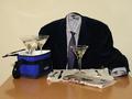
| 07/31/2002 05:12:00 PM |
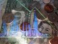
Money Hungryby Ricky CleaveComment: Your picture has impact! "BAM" as Emeril might say. The coloring is sort of surreal, and is very fitting. Something so basic as eating, is so familiar to all. So right off you identify with your audience. VERY GOOD! Then as my eye wanders over the scene I am impacted with UGH! Eating money....yuck! So the photo effectively provoked disdain. VERY GOOD! Brilliant photo. A little bitty thang that is distracting is the crease in the fabric but at least it's on a nice diagonal... :-) Oh and technically...yeah...looks fine to me. 10 Gracious |
| 07/31/2002 07:46:00 PM |
dividendsby magnetic9999Comment: But at what price? The message is well executed and packs some punch. I think I would have composed and/or cropped differently. But art is a personal thing. Both breasts should be equally in focus, unless there is a specific reason that it isn't in your concept. Any way I do like it. |
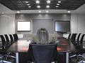
| 07/31/2002 07:27:00 PM |
Running-On-Emptyby amonteforteComment: Alone in "THE boardroom" Lonely at the top. Not that I'd know...lol It looks sterile enough to perform surgery, but probably no clean hands. That's how I read it. Sure meets the "Corporate Challenge." |
| 07/31/2002 03:40:00 PM |
Corporations don't care!by GinaRothfelsComment: I like the clarity of this photo. I LOVE the circular lines in the greenery on the bottom. The rough texture in the background is good too. I like the strong diagonal, and the entire composition. On my monitor the highlights are a little too bright, but not too bad. The theme of the challenge doesn't really seem clear here. Concepts are not easy to portray though. This would be very good for the current challenge. Over all I'll vote "8" Nice work. Gracious |
| 07/31/2002 04:16:00 PM |
|
Home -
Challenges -
Community -
League -
Photos -
Cameras -
Lenses -
Learn -
Help -
Terms of Use -
Privacy -
Top ^
DPChallenge, and website content and design, Copyright © 2001-2025 Challenging Technologies, LLC.
All digital photo copyrights belong to the photographers and may not be used without permission.
Current Server Time: 08/06/2025 01:50:57 AM EDT.