| Image |
Comment |
| 01/27/2003 08:51:33 PM |
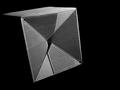
Subtle Squareby BJComment: nice but too subtle...there isn't enough contrast here. But maybe that's what you were going for. |
 Photographer found comment helpful. Photographer found comment helpful. |
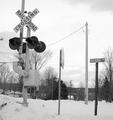
| 01/27/2003 08:42:54 PM |
|
| Photographer found comment helpful. |
| 01/27/2003 08:42:01 PM |
|
| 01/27/2003 07:58:31 PM |
|
| Photographer found comment helpful. |
| 01/27/2003 07:23:36 PM |
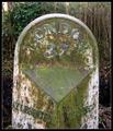
Milestoneby ManicComment: Critique Club Comments by Grayce
This has a wonderful aged appearance that just reeks with character. In this high tech society it is refreshing to see this.
I think this image would benefit from including more of the surroundings. It needs a sense of place. Perhaps a little off center and backed off would really bring this to life.
Regards,
Grayce |
| 01/27/2003 07:00:19 PM |
Last Stop in Lifeby GordonComment: Critique Club Comments by Grayce
Gordon, I'm not really sure what to say about this that hasn't been said already. This is very effective, just as you have it. It's a simple uncomplicated composition that works well.
In this case, having the stop sign centered was a good idea, since it is a sort of "in your face" concept. Thirds wouldn't have been quite as effective.
The "blue rays" look like they're radiating from heaven, which is appropriate.
Great concept, creative, and good use of technique. Congrats!!
Regards,
Grayce |
| 01/27/2003 06:43:13 PM |
On the Roadby lionelmComment: Critique Club Comments by Grayce M. Dillon aka Gracious
The first thing to strike me about this image is the coloring. Yellow and red are both vibrant and cheerful.
The next thing to attract my attention is the familiarity of the subject. Quite universally appealing I think.
I like that you composed the picture with the sign off-center.
There is a line across the center, dividing the image in half. Not especially pleasing. The other drawback is the over-exposed windows. I understand the problem is that by seeing through the bus the highlights were unavoidable. Perhaps the solution may be to expose for the windows, or maybe eliminate the windows completely with a different composition. The coloring here makes a very worthy subject.
Focus is a bit too soft, and saturation could be boosted as well.
Regards,
Grayce |
| Photographer found comment helpful. |
| 01/26/2003 11:53:53 PM |
|
| 01/26/2003 11:52:55 PM |
|
| 01/26/2003 11:50:29 PM |
|
Home -
Challenges -
Community -
League -
Photos -
Cameras -
Lenses -
Learn -
Help -
Terms of Use -
Privacy -
Top ^
DPChallenge, and website content and design, Copyright © 2001-2025 Challenging Technologies, LLC.
All digital photo copyrights belong to the photographers and may not be used without permission.
Current Server Time: 08/25/2025 08:28:04 PM EDT.