DPChallenge: A Digital Photography Contest You are not logged in. (log in or register
 
Browse Settings
Currently viewing:
Registered UserGracious

Show comments:

Per page:

Order:

Comments:


Comments Made by Gracious
Pages:   ... [197] [198] [199] [200] [201] [202] [203] ... [361]
Showing 1991 - 2000 of ~3606
Image Comment
DixieLand
02/17/2003 09:54:28 PM
DixieLand
by RLS

Comment:
Good idea.Wonderfully graphic and very clever name too.
Photographer found comment helpful.
Rows
02/17/2003 02:28:49 PM
Rows
by greenem2

Comment:
Good. Well exposed, except for the blown out window...can't help that, I guess. I love the subject...shelves of books, and wood floors...love it.
Photographer found comment helpful.
Mariachi Rythm
02/17/2003 02:26:25 PM
Mariachi Rythm
by JEM

Comment:
Very well meets the challenge. Good rhythm and pattern.
Photographer found comment helpful.
Making Waves
02/17/2003 02:23:44 PM
Making Waves2nd Place
by kosmikkreeper

Comment:
Nice take on the challenge. Good color, texture and pattern. A bit over-exposed in spots.
Photographer found comment helpful.
Gallery Place-Chinatown
02/17/2003 10:42:28 AM
Gallery Place-Chinatown
by ClubJuggle

Comment:
Critique Club,
This sure meets the challenge, and is very interesting as an abstract. The coloring works well for this, but on a personal note, I'm not sure I like the graininess of it.
The tonality is very good, with lots of variable subtlities. The lines are excellent and lead the eyes inward. Repititious shapes are appealing too.
Photographer found comment helpful.
Spindles
02/17/2003 10:31:47 AM
Spindles
by justine

Comment:
Critique Club Comments by Grayce
Hi Justine, I don't see the grain or artifacts, but I didn't see it in my own submission either, and others did, so I guess I'm not much help in that department.
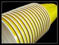
What I like about this is that it is an ordinary, everyday kind of subject, that when examined more closely, as in this image, it highlights the curves and turns.
I like the light and shadows, how the flat part is in shadow. I think a bit more contrast might be nice, but then, the illusive graininess would be highlighted too, I suppose.
This certainly meets the perspective challenge, and the perspective is interesting.
The dof could be improved to satisfy those who want everything in focus. It's all personal taste. It's fine as is for me.
Overall...It's not a compelling image. Most of what you see can be seen in a glance, without inviting deeper study. It would be a good one to play around with it PS just for fun to see what you can come up with. Has potential for a fun abstract...of course not here though...lol
Regards,

Grayce
Deep Within
02/17/2003 09:54:27 AM
Deep Within
by Gracious

Comment:
Sorry about the grain everyone...I don't see it at all. Geeeeeeee....I don't know what to do. I've calibrated my monitor. Thanks for all the comments. Much appreciated! I'd never know about the graininess if not for you all.
Judamohr
02/16/2003 09:33:31 PM
Judamohr
by bgheen

Comment:
I like how you incorporated the human limb, into the tree limbs. Very creative approach.
Concealed
02/16/2003 09:32:01 PM
Concealed
by Remie

Comment:
I like this. Good job! I appreciate the barely there appearance, and the composition works well.
Empty promenade
02/16/2003 09:30:53 PM
Empty promenade1st Place
by mirac

Comment:
I like your perspective, and the trees have a beautifully aged appearance. It reminds me of one of my favorite places on earth...the Bronx Zoo. www.wcs.org. Nice comp, well exposed, good choice of b & w. Good luck!
Photographer found comment helpful.
Pages:   ... [197] [198] [199] [200] [201] [202] [203] ... [361]
Showing 1991 - 2000 of ~3606


Home - Challenges - Community - League - Photos - Cameras - Lenses - Learn - Help - Terms of Use - Privacy - Top ^
DPChallenge, and website content and design, Copyright © 2001-2025 Challenging Technologies, LLC.
All digital photo copyrights belong to the photographers and may not be used without permission.
Current Server Time: 08/26/2025 01:20:07 PM EDT.