|
|
|
Showing 1981 - 1990 of ~3606 |
| Image |
Comment |
| 02/22/2003 06:43:47 PM | Fresh Paintby kpskhalsaComment: Beautiful, vivid colors! You can make this larger you know. Anyway I like it. |
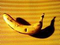
| 02/22/2003 06:42:37 PM | 120 Seconds of Fameby stephanComment: The bg is very interesting and the banana is a good idea. I like it except for the over-exposed spot on the banana. |  Photographer found comment helpful. Photographer found comment helpful. |
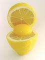
| 02/22/2003 06:36:57 PM | Lemon Eggby BullwinkleComment: odd picture but technically fine and meets the challenge well. High score. | | Photographer found comment helpful. |
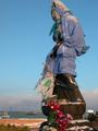
| 02/20/2003 05:18:00 PM | Goddess of Mercy in winter outfitby kenboComment: Critique Club Comments by Grayce
The composition of this is very good, but the crop is a little too close to the head. I'd like to see a little room there.
Color saturation, and exposure are both good..
The subject is a little mysterious. Makes me wonder what this is all about, and why is it covered up? For that reason it draws the viewer in.
I don't find this very appealing, so I'm not really sure what else to say. I see others are quite fond of it, so it really is a matter of taste.
Just keep on enjoying your photography.
Regards,
Grayce |
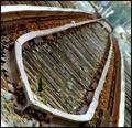
| 02/20/2003 04:51:06 PM | On The Right Trackby spidermanComment: Greetings from the Critique Club
The subject is a good one, and popular with many. It's sort of timeless, with little change over the years. So at the same time it is current and nostalgic.
The depth of field seems to work just fine, although I'd like to see the whole a little sharper.
All the wood within the tracks is wonderfully textural and adds much dimension to the image.
I like the crop but, personally, not the angle. I understand it is a matter of personal taste though, and others really like it.
Overall a decent image that could be presented in several different ways.
Regards,
Grayce | | Photographer found comment helpful. |
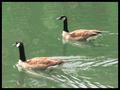
| 02/19/2003 10:03:40 PM | Guess which oneby pitsamanComment: Greetings from the Critique Club!
This image has quite a bit of potential. The birds are an interesting subject and the setting is very good.
The coloring is very drab. It may actually be better as a black and white picture, but the contrast needs to be pumped up a bit and the whole thing needs to be sharper. You could try the unsharp mask in PS or something similar in your software.
About it meeting the challenge, well I don't see a person in the picture, which is what the description asked for. That is very important on this site...to meet the challenge.
I hope this helps. Enjoy yourself!
Regards,
Grayce | | Photographer found comment helpful. |
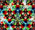
| 02/19/2003 09:22:06 PM | Crystallized Waldoby daysezComment: Critique CLub Comments by Grayce
This image is catchy and colorful. There are areas where it is over-exposed, but in general the colors are good and this is an exciting image.
There are none like it in the challenge, so it scores high for originality.
I don't see a clear human, but I assume that the faces in the red crystals are Waldo's reflection?
The composition is good, and balanced.
Overall there isn't a clarity, that my eyes seek as they wander around, but I appreciate your creativity.
Regards,
Grayce |
| 02/19/2003 09:13:20 PM | Reflections?by ChuckieComment: Greetings from the Critique Club!
Your idea of using a reflection is a good one, but the execution of the idea needs a little work.
The focus isn't real sharp. when I see the brick beside the vending machine that becomes even more evident.
The inclusion of the softdrink cooler doesn't add virtue to the picture. It actually distracts, and competes with the vending machine.
The subject, the vending machine, isn't by nature a very interesting subject, however it could be if focused on a part of it, like the 3 rows of empty circles where snacks have been depleted. If you cropped to that, and perhaps tilted the camera, you'd have an interesting abstract of a repititious pattern. That's just my first idea, although there are others. There is always more than one way to compose an image, and you want to grab the attention of the viewer.
Perhaps a vertical format would have excluded the unnecessary elements.
I'll look forward to seeing your next submission. Enjoy yourself!
Regards,
Grayce |
| 02/19/2003 09:40:21 AM | |
| 02/17/2003 10:00:12 PM | Onward Sailby jerrftComment: I like the composition, and the colors but the focus is a little off. | | Photographer found comment helpful. |
|
Showing 1981 - 1990 of ~3606 |
Home -
Challenges -
Community -
League -
Photos -
Cameras -
Lenses -
Learn -
Help -
Terms of Use -
Privacy -
Top ^
DPChallenge, and website content and design, Copyright © 2001-2025 Challenging Technologies, LLC.
All digital photo copyrights belong to the photographers and may not be used without permission.
Current Server Time: 08/26/2025 01:27:22 PM EDT.
|