| Image |
Comment |
| 04/07/2005 07:17:00 PM |
The Greater Daneby Gil PComment: Maybe going on the the abstract side of the challenge I don't know? But I feel the over exposure is killing the shot somewhat, from what I can tell the DOF is pretty good yet spoilt by all the white reflections. |
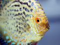
| 04/07/2005 07:13:53 PM |
Wanda the Tropical Fishby Pug-HComment: Great Discus shot :0), love the crop and the DOF although the fin would have been great a bit sharper yet a difficult capture I'm sure as I used to have a couple of discus - very timid creatures indeed from what I recall as mine were quite easy to upset if I broke there routine. Be nice to see some of the out takes after the challenge ends... 10 |
 Photographer found comment helpful. Photographer found comment helpful. |
| 04/04/2005 03:24:26 PM |
|
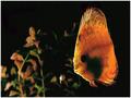
| 04/04/2005 03:17:38 PM |
Contactby PanoComment: Great composition but I think that although the colour of the Discus could be better with the use of different light the eye is too dark but perhaps you wanted the dark background to emphasize the fish. Just a shame the vivid colours seen around the edges were not more prominent all over :0) Good shot |
| Photographer found comment helpful. |
| 04/04/2005 03:15:15 PM |
Rush Puppyby eaglebeckComment: possibly suffering from a little camera shake this is quite blurry, a shorter shutter speed or the use of a tripod could help ( maybe even a pet that stays still... I know mine wouldn't !!! ) |
| 04/04/2005 03:05:35 PM |
Zackby GolferDDSComment: POssibly needs the levels bringing up a little as the could look a little greener ( the live bits ) and the frisbie is also very very stark. |
| Photographer found comment helpful. |
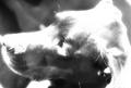
| 04/04/2005 03:04:13 PM |
"TRUE LOVE"by joansuzyComment: presumably gone down teh route of not having a black background and dropping one in via the means of an art package. If you do this again I suggest using a little blur on the outlines to disguise this better as it looks like cut and stick. The cats white fur also seems over exposed or just no clarity of focus. |
| 04/03/2005 07:38:25 PM |
See_throughby atxcrisComment: Great shot but cant understand how this begins or the relevance? However to improve the shot I would prefer to see a better focus on the whole overall image by getting the whole shot in focus with better use of aperture and amending the colours of the LCD panel to diplay the exact same light emitting from the light on the wall as the monitor appears to be a few shades darker. Great concept, great idea, wrong challenge. |
| 04/03/2005 07:26:07 PM |
|
| 04/03/2005 07:19:22 PM |
"Buds"by sfarrell23Comment: love the border but feel that you could have gone with a single pixel line and a continution of the image to give it a great NEW effect, if unsure ho wI mean please contact me once the challenge finishes ( yeah I know thats quite picky but just saying what I feel ), and theres nout wrong with the shot BTW :0) good job 8 |
| Photographer found comment helpful. |
Home -
Challenges -
Community -
League -
Photos -
Cameras -
Lenses -
Learn -
Help -
Terms of Use -
Privacy -
Top ^
DPChallenge, and website content and design, Copyright © 2001-2025 Challenging Technologies, LLC.
All digital photo copyrights belong to the photographers and may not be used without permission.
Current Server Time: 06/18/2025 10:33:47 PM EDT.