| Image |
Comment |
| 11/23/2004 11:50:23 PM |
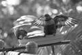
Rosellasby neehaiComment: I would have liked to see a tighter crop on the bird on the right. I'm sure it's been said already, but the remainder of the image is not really interesting to me. Still, the backlighting is superb and the foliage in the background lends itself to the subject. Next time, though, get closer and see what comes of it. :) |
| 11/23/2004 11:16:08 PM |
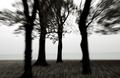
As The Crow Fliesby flip89Comment: Excellent work here. The only niggle is that there appear to be two horizons in the image, seemingly tilted in opposite directions. You made the right choice by making the tree perfectly vertical, but the horizontal orientation points out the flaw in the horizon. Re-compose in the portrait/vertical orientation and you have a winner. |
 Photographer found comment helpful. Photographer found comment helpful. |
| 11/23/2004 11:12:35 PM |
First Impressionby Rando D300Comment: Fresh and vibrant. I like this relationship established between the woman and puppy. The background is a distraction though. I also, I think you could have cropped some more out of the top and gotten a stronger image. Lastly, the post-processing seems to have smoothed out the woman's face a bit too much, making her face seem flattened. |
| Photographer found comment helpful. |
| 11/23/2004 11:09:33 PM |
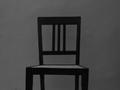
stare chairby surenComment: My only 10 of the challenge. I'm not sure why, but this image captivates me. I must be boring and mundane. LOL! |
| Photographer found comment helpful. |
| 11/17/2004 12:33:05 AM |
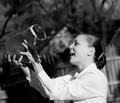
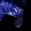
Celestial Flow by BradComment: Great shot. I'm curious about your indication of the use NeatImage twice on the image. Anyway, great shot and congrats on the ribbon. You are now the official "guy who keeps winning ribbons" guy. |
| Photographer found comment helpful. |
| 11/16/2004 07:20:02 PM |
A Growing Bandby KeysComment: Holy crap! This is sooooo much better than 2% percentile. Keep shooting, Payam, because this photo is good. Much better than these fickle photos can imagine. |
| Photographer found comment helpful. |
| 11/16/2004 02:09:24 PM |
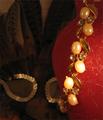
Seductionby supradaComment: This shot is very confusing. The bright highlights on the pearls (?) of the jewelry draw my eye, but there's not much going on there. So, then I hunt for another subject and immediately get distracted by blurry sequens (sp?) in the background. Also, I'm not sure what the red object is, but it looks kinda dirty or something. It's drawing my attention from the jewelry. I think you've attempted something interesting here, but it needs more light and more careful placement of objects in the frame. |
| Photographer found comment helpful. |
| 11/15/2004 08:31:26 PM |
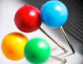
Red GBY Flowersby akshaComment: I'm giving you a 5 and I'll tell you why. I like the composition and the highly magnified nature of the photo. What I have a problem with is the general lack of balance in the image. Having the subjects tilted so severely makes me lean to the left. Also, having 4 subjects in the frame is a little disorienting. Together they form a square or circle, which makes me visually just go from each pin head to the next without stopping on one. The lines on the right are just a distraction and should go away. But the colors are bold and if you'd have omitted the yellow or green tack and gotten rid of the distracting lines, I would have given you a 7. Hope I was helpful. |
| Photographer found comment helpful. |
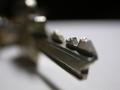
| 11/15/2004 08:26:06 PM |
Keyby SirBiggsALotComment: Very nice. It's difficult to get such shallow depth of field to remain interesting, but I find the area of focus rather appealing for some reason. The dark element in the background near the top of the shot, however, detracts from the image and should have been the same tone as the foreground. Also, there is so little color in this scene, you might just as well have converted to black and white. I think the lighting is really very good. The highlights coming off the key are interesting. Perhaps adding some noise/grain to the image would make it a more moody, bizarre shot. But I like it. Nice work. 7 |
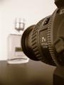
| 11/15/2004 08:19:48 PM |
Taking a macro shot...by speedylixComment: Nice concept here. You are telling a story often told by a photographer, and I can relate to that. I wonder whether a little more color would have added some interest. Perhaps a band of orange or blue light falling across the "7x" to further lead the eye to that section. Also, the word "MACRO" on the lens is a bit difficult to read, but when you think about it, it's a pretty important part of the picture. Perhaps compose at a different angle and make it more readable. Nice, quality effort at a "stock" like image. |
| Photographer found comment helpful. |
Home -
Challenges -
Community -
League -
Photos -
Cameras -
Lenses -
Learn -
Help -
Terms of Use -
Privacy -
Top ^
DPChallenge, and website content and design, Copyright © 2001-2025 Challenging Technologies, LLC.
All digital photo copyrights belong to the photographers and may not be used without permission.
Current Server Time: 08/25/2025 09:04:14 PM EDT.