| Image |
Comment |
| 08/24/2004 01:28:40 AM |
Peacefulby menardmamComment: Smart, seductive, and compositionally brilliant. The grainy, softness of this image evokes a wonderful sense of calm. I really don't have anything bad to say about this image, so it gets my highest score. Top 10 for sure. |
 Photographer found comment helpful. Photographer found comment helpful. |
| 08/24/2004 01:26:11 AM |
Odalisqueby JesuispeureComment: Wow, she's beautiful and that stare! That stare is what gets me. I love the soft focus and it's been used very well here. I only wish the edge of the bed/couch/whatever wasn't visible in the bottom right. Still, I give it a 9. |
| Photographer found comment helpful. |
| 08/24/2004 01:24:27 AM |
FREE WILLYby siggiComment: So simple. So effective. I think maybe the image would speak to me, personally, a little more if there was a female companion joining him. Still, it's a 10 and I love it. |
| Photographer found comment helpful. |
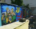
| 08/19/2004 07:09:55 PM |
Radiant colors protecting some last remains of the Berlin wallby johnmkComment: Title is a little wordy, but who cares. THe inclusion of the photographer is important here and I'm glad you thought to do it. Otherwise, it's a pretty flat image. Lighting is quite harsh and would have been improved by catching the same scene later in the evening, with maybe some spot lights on the bright wall to accentuate. |
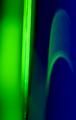
| 08/19/2004 07:07:10 PM |
Parallel rulerverseby shangri_La_gypsyComment: I don't care for the title, but I dig the abstract nature of the photo. I find myself wanting to know what I'm looking at and not being particularly annoyed that I can't figure it out. The green and blue are strikingly complementary and fit the challenge superbly. What could you improve? Well, maybe make the bright neon green thing perfectly straight up and down. Other than that, it's slightly noisy near the bottom in the darker areas. I really enjoyed this though. 8. |
| Photographer found comment helpful. |
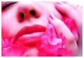
| 08/19/2004 07:06:36 PM |
Pink Passion by ScantyNebulaComment: This is quite nice and is a potential ribbon winner. The texture in the fake flowers is not really doing anything for me though and I wonder if a more silky flower (or real flowers for that matter) would have improved it. |
| Photographer found comment helpful. |
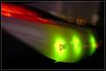
| 08/19/2004 06:44:43 PM |
Power of neonby madmax69Comment: Very cool abstract. It's interesting how much information lies in those three little letters. We know this a picture of some sort of electronic device, but little else can be derived. The placement of the focal element in the frame is quite good. I dunno, I'm just a sucker for these shots. 7. |
| Photographer found comment helpful. |
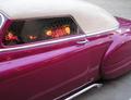
| 08/19/2004 06:42:33 PM |
Nostalgiaby xtabintunComment: Very similar idea to another shot and you've done a better job getting the idea across. Generally speaking, this shot seems to look better when it's a little darker outside than you've taken. But don't make it too dark or you'll lose the detail of the vehicle, like what happened in the other similar car reflection photo. |
| Photographer found comment helpful. |
| 08/19/2004 06:39:12 PM |
After Hours: Hustle & Bustleby dhareComment: Would have been so much better if the people in the shot were actually blurred, further denoting the "hussle and bustle" you've captured. I probably would have focused on either the newstand -or- the restaurant, but not both. |
| Photographer found comment helpful. |
| 08/19/2004 06:29:09 PM |
Live Blues Nightlyby dsa157Comment: In spite of the current sentiment in the forums, this kind of treatment of neon signs is not easy. You have composed this sign beautifully. It takes me back to an age of glamour long past (not that I ever knew that age). You force me to "look up" at the sign with the wide angle view, causing me to feel like I'm there on the sidewalk. I give you a 10 for composing what I feel to be the most fitting image of the challenge (though not necessarily the most technically perfect). |
| Photographer found comment helpful. |
Home -
Challenges -
Community -
League -
Photos -
Cameras -
Lenses -
Learn -
Help -
Terms of Use -
Privacy -
Top ^
DPChallenge, and website content and design, Copyright © 2001-2025 Challenging Technologies, LLC.
All digital photo copyrights belong to the photographers and may not be used without permission.
Current Server Time: 08/25/2025 11:46:19 PM EDT.