| Image |
Comment |
| 03/29/2011 12:17:39 AM |
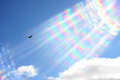
Bird Before the Stormby kenltComment: It seems like the only color comes from the out of focus leaves in the foreground. As is I think it would be better in bw. In color, I feel like at least the sky needs to have some color or texture. |
| 03/29/2011 12:15:40 AM |
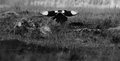
Cathartes auraby posthumousComment: I love the idea here. The pattern of the iridescence just turns out to be far to distracting and manufactured looking (perhaps because it was an aggressive crop on the original). That said, I think I would have liked this much more if you just cropped this much more tightly around the bird. The iridescence is just far too dominant and seems to be the subject of the photo. |
 Photographer found comment helpful. Photographer found comment helpful. |
| 03/29/2011 12:15:25 AM |
|
| Photographer found comment helpful. |
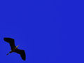
| 03/29/2011 12:14:33 AM |
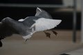
Flight In The Style Of Zenby mefnjComment: Neat. I don't think I like the color of the sky, and for me the placement of the subject neatly in the corner doesn't work. |
| Photographer found comment helpful. |
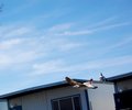
| 03/29/2011 12:13:43 AM |
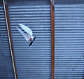
Soaring Soloby Tabatha15Comment: Too bad the ugly building was right behind the bird. I feel like the shot needs to at least be straightened out, the building isn't compelling enough to work at an angle. It seems like the bird isn't in focus. |
| 03/29/2011 12:12:33 AM |
|
| Photographer found comment helpful. |
| 03/29/2011 12:12:06 AM |
|
| Photographer found comment helpful. |
| 03/29/2011 12:11:32 AM |
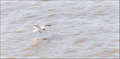
Landing by crikComment: It's just too washed out, and to me the bird is too small (I suggest a tighter crop). |
| Photographer found comment helpful. |
| 03/29/2011 12:10:49 AM |
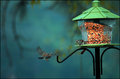
Birds Of A Feather...by fotofanComment: The way this shot is composed, the feeder is too dominant and fake looking, and I feel like something needs to be sharply in focus (though I can't find something). I bet if you cropped it to include just the bird on the left (and not the feeder, or at least the "building" part of it) that this would have done very well. The colors and bokeh of the background are amazing. I like the expression/action of the bird on the feeder, but not being in focus kills it for me. |
| Photographer found comment helpful. |
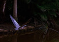
| 03/29/2011 12:08:06 AM |
Flying Up Streamby BrianRComment: The shot is far too dark. The highlights on the palm on the right jump out as much or more than the subject and really detracts from the overall texture and feel of the photo. |
| Photographer found comment helpful. |
Home -
Challenges -
Community -
League -
Photos -
Cameras -
Lenses -
Learn -
Help -
Terms of Use -
Privacy -
Top ^
DPChallenge, and website content and design, Copyright © 2001-2025 Challenging Technologies, LLC.
All digital photo copyrights belong to the photographers and may not be used without permission.
Current Server Time: 08/19/2025 11:18:46 PM EDT.