| Image |
Comment |
| 11/12/2003 11:04:32 PM |
|
 Photographer found comment helpful. Photographer found comment helpful. |
| 11/12/2003 09:07:45 PM |
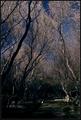
Sacred Groundsby heidaComment: I see the trees and like the formation, but I can't tell what I'm seeing on the ground. A bit too dark. |
| Photographer found comment helpful. |
| 11/12/2003 09:05:35 PM |
Morning Coffee and Prayerby EmerauldeComment: Good perspective, surface choice. But the drops all over the cup are kind of subjectively unattractive. Fresh full cup of coffee would have been great. This is the right perspective though. There was another one, a picture of a starbucks cup, and i told him do do something like this (even before I saw yours!) |
| 11/12/2003 03:07:00 PM |
|
| Photographer found comment helpful. |
| 11/12/2003 03:06:31 PM |
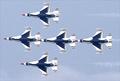
Wings Of Fireby TomH1000Comment: Good decisive moment shot; some noise could have been removed by NeatImage. |
| Photographer found comment helpful. |
| 11/12/2003 12:27:03 PM |
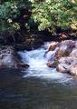
special trout holeby wetlandComment: Nice comp; good exposure; seems a little unsharp and unclear; perhaps movement blur for low shutter speed (not talking about the water, that's fine, its the tree and rocks...) |
| Photographer found comment helpful. |
| 11/12/2003 12:24:44 PM |
Cape Cod Canalby jmritzComment: Nice sky and scene. Not really a good horizon to measure, but it appears tilted slightly left. |
| Photographer found comment helpful. |
| 11/12/2003 12:23:57 PM |
Home Sweet Homeby christyrackComment: Nicely scene, but you really challenged yourself to a tough exposure! The overexposed background is a bit distracting. |
| 11/12/2003 12:22:47 PM |
Reflecting Upon Religionby michael_pComment: Nice composition; This would be helped by a more interesting sky. Even as is, I think a haze filter and maybe polarizer would have helped. |
| Photographer found comment helpful. |
| 11/12/2003 10:35:28 AM |
I swear, he didn't move!by SoulHunter74Comment: I think the background is interesting, and I can accept the effect you tried with the overexposure. I think it's pretty obvious it was intentional.
It's a decent photo, but think about it: your background effect draws attention to it. But does the moose? The lighting on the moose is pretty flat, and he's even positioned outside of the "glow". (Note if you put him in the glow, you would probably need to change the crop so its not the center.)
One other thing, the perspective distortion is obvious on the left because of the tile lines. It might also have been interesting to have a square perspective here. |
| Photographer found comment helpful. |
Home -
Challenges -
Community -
League -
Photos -
Cameras -
Lenses -
Learn -
Help -
Terms of Use -
Privacy -
Top ^
DPChallenge, and website content and design, Copyright © 2001-2025 Challenging Technologies, LLC.
All digital photo copyrights belong to the photographers and may not be used without permission.
Current Server Time: 08/28/2025 10:41:20 AM EDT.