| Image |
Comment |
| 12/14/2003 10:00:21 AM |
A simple complexby jonpinkComment: A good capture of the moon, simple shot too. I find the composition/crop here not very dynamic. Too close to the edge perhaps or too much dead space. I think you might keep it in the left or top third, and crop a bit tighter. |
| 12/14/2003 09:58:13 AM |
As Simple As ...by GeneralEComment: Simple on two planes. A good arrangement too. I think you should have tried to postprocess with neatimage or other two get rid of the "aging" on the surface of the letters. That plus the slight reflections make them look less apealing and detract from the shot. |
 Photographer found comment helpful. Photographer found comment helpful. |
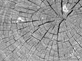
| 12/14/2003 09:56:50 AM |
Spots in the sunby cimarron98Comment: A good abstract and shot. Two comments from a viewers perspective: 1) the white spots don't fit the pattern nor blend well with the lovely textures of the wood. 2) I would have liked to see the wood grain better. Maybe via a different contrast/toning adjustment, or maybe by having the natural colors show. |
| Photographer found comment helpful. |
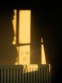
| 12/14/2003 09:54:35 AM |
A wall, a radiator, and light.by mbardeenComment: I think this is more interesting than many of the nail shots we see here in the challenge. I do have a few technical issues though: IThe lack of clarity of the light and shadows on the wall detracts from this as an abstract or geometric design. The perspective shift of the radiator suggests that this could have been made even more interesting by shooting it from a more pronounced angle, say the floor. Maybe even tilting the camera. A large depth of field should have been able to capture the shadows in focus as well. |
| Photographer found comment helpful. |
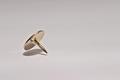
| 12/14/2003 09:51:37 AM |
Design Classicby robsmithComment: Nice clear shot. Good twist to have it in air, but it's less dynamic than it could have been if a bit further up. While you did a very good job on this meeting the challenge, with some flare, I don't think it's as interesting a subject as many have found here. (Though this is one of the better nail theme shots in the challenge!) |
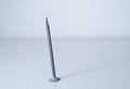
| 12/14/2003 09:48:25 AM |
Leanby LucidLotusComment: Can't get much simpler than this. Good job overall, but if you forgive the pun, the base of the nail is not "tack sharp", and I think it should be here. (Also, the line in the background competes.) |
| Photographer found comment helpful. |
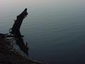
| 12/14/2003 09:47:50 AM |
Dead(wood) Calm(water)by GREENMEMComment: A very simple shot, using the rule of thirds. However, since there's so few elements here, and so little form in the frame, I think it might have worked better without using a sillouette approach (that would of course, depend on how the wood actually looked!). Or maybe just not quite so dark, so we could see some of it's texture and detail. |
| Photographer found comment helpful. |
| 12/14/2003 09:43:45 AM |
My Father's Cupby space amoebaComment: I like the way you've placed this on the table and used the patterns of the table to give this an geometric design, though in general centered compositions are a bit weaker, and the pattern here is perhaps not strong enough to make this work as pop-art does, or as an abstract. |
| Photographer found comment helpful. |
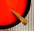
| 12/14/2003 09:40:45 AM |
Soupby TommyMoe21Comment: A good simple "pop-art" composition, well done overall. I think it might have been better with an evenly exposed white mesh placemat rather than the overexposure there (I presume this is intentional to give the photo some extra dynamics). As I look at it longer, it might have also been good to experiment with different spoons to try to make the spoon more "attractive" (not detailed, but perhaps a little longer out of the soup than it is, or extra wide handle, or some more geometric shape without fancy detail. Our spoons are more shapely ;)
Overall, nice work. |
| Photographer found comment helpful. |
| 12/13/2003 02:10:08 PM |
|
| Photographer found comment helpful. |
Home -
Challenges -
Community -
League -
Photos -
Cameras -
Lenses -
Learn -
Help -
Terms of Use -
Privacy -
Top ^
DPChallenge, and website content and design, Copyright © 2001-2025 Challenging Technologies, LLC.
All digital photo copyrights belong to the photographers and may not be used without permission.
Current Server Time: 09/01/2025 11:23:02 PM EDT.