| Image |
Comment |
| 02/02/2004 10:52:41 PM |
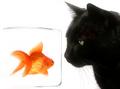
And the plot thickens... by kosmikkreeperComment: Excellent hi key shot! I don't know if a fish and a cat go together (but I bet the cat thinks the fish would go nice with a little milk. ;) |
| 02/02/2004 10:50:04 PM |
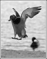
Duck to Waterby crabappl3Comment: Good capture of the moment. Overall a good shot, but there needs to be more light on the ducks face and eye (or just underexposed there). |
| 02/02/2004 10:48:20 PM |
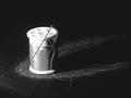
granny's needle and thread spotlightedby camelotnorthComment: Nice idea overall (a good pairing, needle and thread!), good idea for directional light here, but it looks overexposed on the spool, and it might have been good to have all the thread highlighted (it crosses into the dark areas in the foreground and on the right. |
 Photographer found comment helpful. Photographer found comment helpful. |
| 02/02/2004 07:50:19 AM |
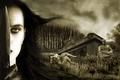
Fantasiaby GordonComment: Well done and congratulations. Well deserved win! |
| Photographer found comment helpful. |
| 02/01/2004 07:15:04 PM |
|
| Photographer found comment helpful. |
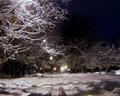
| 02/01/2004 03:34:58 PM |
City Street at Night #2by TooCoolComment: A good rework. It's much better as cropped.
As to the other changes, overall, I like this, but I am ambivalent about the loss of color; Not that color is needed per se, but it seems to have lost just a bit of the contrast and detail in the snot on the street, and the lights in the bacground lose a little of their aesthetic appeal. |
| Photographer found comment helpful. |
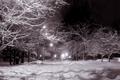
| 01/31/2004 12:10:31 AM |
City Street at Nightby TooCoolComment: Nice shot; I would suggest cropping 1/4 inch from the top to get rid of the brightest area, then your eye is not drawn to it and the rest of the shot can work for you. I like the lighting effects here and the perpendicular tracks and shadows. |
| Photographer found comment helpful. |
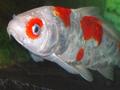
| 01/29/2004 01:23:34 AM |
One Sad Fishby basia03Comment: Good capture in a tank. Excellent lighting, but could be sharper. |
| Photographer found comment helpful. |
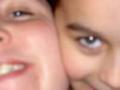
| 01/28/2004 11:43:09 PM |
the twins? (Gemini)by Jamie2772Comment: An interesting composition, but too small of a photo to upload, and it's unfortunately out of focus. |
| Photographer found comment helpful. |
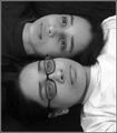
| 01/28/2004 11:04:02 PM |
Gemini's Twinsby RoosterComment: Interesting idea; I think I would have worked on more similarity in the faces by removing the glasses. Also, the black and white tops add a nice contrast, but the black top blends into the background so it doesn't give a good contrast effect. Actually, since it blends so well, it might have been cool if they both had black tops, leaving just the two heads. Then you might consider rotating it so one is upside down and the other is right-side up. As you can see, I think you are onto something good here, and while you may be satisfied with this nice shot as is, there's some other areas to explore! |
| Photographer found comment helpful. |
Home -
Challenges -
Community -
League -
Photos -
Cameras -
Lenses -
Learn -
Help -
Terms of Use -
Privacy -
Top ^
DPChallenge, and website content and design, Copyright © 2001-2025 Challenging Technologies, LLC.
All digital photo copyrights belong to the photographers and may not be used without permission.
Current Server Time: 09/02/2025 05:28:53 PM EDT.