| Image |
Comment |
| 07/31/2002 03:41:00 PM |
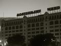
The Endby jkirkla1Comment: Was this taken at night, it seems very dark and those lights at the bottom make me wonder. I have no idea who Montgomery Ward are, do I need to know before I can judge this or is it just a generally run down looking building. Sorry, not sure about this at all. |
| 07/31/2002 03:45:00 PM |
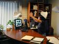
You only gave him a 5?!?!@&*^%@by JEFFCOWLESComment: Nicely caught action in this one, I'm not sure the image on the monitor has come out clear enough for me to understand the full meaning of your title though, shame. Nice office lighting effect, captured the set-up just right and those bits which are meant to be sharp are sharp. If that's a Starbucks coffee cup on the far side then it is a marginally better picture of one of those items than another one I have just commented on. |
| 07/31/2002 04:47:00 PM |
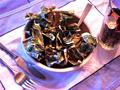
Money Hungryby Ricky CleaveComment: Why are the knife and fork upside down? IMHO the colours look a bit odd, too much blue cast and generally a bit fuzzy. |
| 07/29/2002 12:14:00 PM |
|
| 07/31/2002 04:52:00 PM |
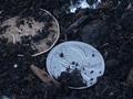
"Dirty money"by awmk1981Comment: The coins don't appear to be in sharp focus, this may sound odd but the lack of colour in this colour image makes it look flat and uninteresting. If you convert it to greyscale and make it a definate balck and white image it has more punch. I would alos crop away all that excess dirt on the right and get rid of the bright patch at the top. |
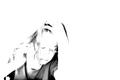
| 07/31/2002 04:17:00 PM |
Customer Dissatisfactionby mciComment: I can't make up my mind with this one. There is just enough detail there to catch her expression and I think I like the high key look. I'm not sure of the composition, did you try it with the woman filling the frame, ie cropped along her left arm and tight over her head. I can't decide which works best, yours is certainly the more unexpected look. Will have to come back to this. |
| 07/29/2002 12:12:00 PM |
|
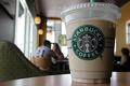
| 07/31/2002 03:36:00 PM |
Starbucksby chariotComment: This is the best picture of a Starbucks coffee cup I have seen today. That can't be coffee in there can it? it looks foul. I know there's not much to play with here but it looks a little dull and lifeless, no striking colours or anything to make it other than a snap of a plastic cup. The image is a little dark on the right side. |
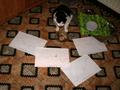
| 07/31/2002 04:57:00 PM |
A litle lunchbreak at work,made by christian 12 yearsby Christian-12-YearsComment: Not a bad effort for a 12 year old, you need to learn how to get lighting sorted out in your photos, this one is way too dark. Maybe a less busy background would help also. Nice idea with the cat ( I hope he doesn't mind you implying he is a fat cat) does he/she always get fed off a silver tray? |
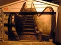
| 07/31/2002 03:29:00 PM |
Are we going up?by tonythemonkComment: First of all I don't get it. Secondly it appears to be a mural painted on someones garage wall/door. If that is the case then all you have done is copy someone elses art.(unless you painted it I suppose) It appears to have been taken at night and the artificial light has produced unattractive colouration. The top right is overexposed and the bottom is too dark. |
Home -
Challenges -
Community -
League -
Photos -
Cameras -
Lenses -
Learn -
Help -
Terms of Use -
Privacy -
Top ^
DPChallenge, and website content and design, Copyright © 2001-2025 Challenging Technologies, LLC.
All digital photo copyrights belong to the photographers and may not be used without permission.
Current Server Time: 08/21/2025 03:32:21 PM EDT.