| Image |
Comment |
| 07/30/2002 07:02:00 PM |
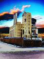
Customer Dissatisfactionby mciComment: I like the idea but its too blown out. I'd like to see some more detail. Also the white doesn't really symbolize dissatisfaction to me. I might have tinted this whole thing red or maybe left it in color and used high saturation. Hmm... I wonder what that would have looked like. |
| 07/30/2002 09:56:00 AM |
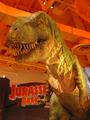
Corporate Giantby mikeysbistroComment: Jurassic Park 2 sucked but they redeamed themselves with 3.... sort of. Background is distracting. My first suggestion would be to use a shallower depth of focus to isolate the dinosaur from the roof but then you might loose the sign on the left. |
| 07/30/2002 07:00:00 PM |
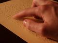
Corporate Leftoversby gigageekComment: I kinda like. I don't like the posterize effect too much. I do like the heavy saturation though. |
| 07/22/2002 02:32:00 PM |
|
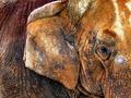
| 07/24/2002 06:24:00 PM |
Revelationby welcherComment: I tend to like photos that have the focused area in the foreground. Here the foreground is the unfocused, then the focused and then more unfocused. |
| 07/22/2002 02:02:00 PM |
|
| 07/24/2002 06:23:00 PM |
|
| 07/22/2002 11:13:00 AM |
Saggy Baggy by PatellaComment: This kinda looks like you just too a picture of a painting. If so, I really hate it. I can't stand it when people take pictures of a picture. I will give you credit that other than the flash its hard to tell if this was just a picture of a painting or not. Their appears to be a flash reflection on the right. |
| 07/22/2002 02:38:00 PM |
|
| 07/22/2002 02:26:00 PM |
|
Home -
Challenges -
Community -
League -
Photos -
Cameras -
Lenses -
Learn -
Help -
Terms of Use -
Privacy -
Top ^
DPChallenge, and website content and design, Copyright © 2001-2025 Challenging Technologies, LLC.
All digital photo copyrights belong to the photographers and may not be used without permission.
Current Server Time: 08/19/2025 07:03:22 AM EDT.


![american cheese[grater]](https://images.dpchallenge.com/images_challenge/0-999/25/120/Copyrighted_Image_Reuse_Prohibited_3711.jpg)