| Image |
Comment |
| 06/06/2002 12:01:00 AM |
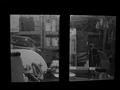
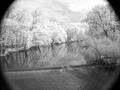
Looking in the Shed at Nightby HoltwComment: Yup, that's the inside of a shed alright. But why should I care? I don't see a real point of interest, just a bunch of stuf fon shelves and lying around. |
| 06/05/2002 11:59:00 PM |
cave in to the darksideby heartsdivideComment: Its an interesting photo. I'm not sure where the subject is as you have three different points that I look at, the face, the light in the mirror and the "Cave in" on the t-shirt. The glasses have some spots that reflect the light and you've got a shiny nose. I think you have a decent idea of photography, but the whole thing just doesn't work for me. |
| 06/05/2002 10:48:00 PM |
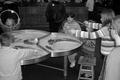
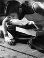
Bubble Makersby rajronComment: If bubble makers were your interesting you should have fill the screen a bit more with them. I see a great photo within your photo. Look at the girl on the left. She looks perfect holding up this ring and looking at it with wonder. If you would have just gotten down on one knee would have taken the picture across the table to that little girl you would have a great picture. Also unless your subject is a shadow or you are taking things at sunset or sunrise with attractive shadows, try to avoid them. You have bad shadow to the left of the boys face on the right. That sort of thing detracts from your picture. |
| 06/03/2002 12:11:00 PM |
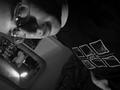
mostly 'armlessby ManicComment: Hey didn't I see you in a movie! I'm starting to think my monitor is a bit fuzzy cause this is the third picture I see that I think needs some focus. |
| 06/03/2002 12:52:00 AM |
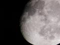
Crystal Ballby DigipixerComment: Beautiful picture. The vignetting takes away from the image rather than add to it. |
| 06/03/2002 12:09:00 PM |
|
| 06/03/2002 12:54:00 AM |
Focusby zaynoComment: I wanna say I want more focus, but I kinda like the softness of it. I'm undecided. |
| 05/28/2002 03:38:00 PM |
Is This Right?by Dangerous_bluesComment: Good idea. Too much light from above and behind the head. You need another light maybe just to the left of the camera to light the face a little. |
| 05/31/2002 06:02:00 AM |
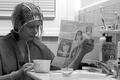
Ms. Miaoby iraeComment: Very nice portrait. I like the use of Sepia. Very pretty model. |
| 05/31/2002 12:14:00 PM |
Time To Killby YoodioComment: To broad of a shot. Your subject should be people and your subject fill the frame or the area around your subject should some how contribute to your subject. That is not happening here. |
Home -
Challenges -
Community -
League -
Photos -
Cameras -
Lenses -
Learn -
Help -
Terms of Use -
Privacy -
Top ^
DPChallenge, and website content and design, Copyright © 2001-2025 Challenging Technologies, LLC.
All digital photo copyrights belong to the photographers and may not be used without permission.
Current Server Time: 08/21/2025 11:16:08 AM EDT.