| Image |
Comment |
| 02/01/2004 12:26:06 PM |
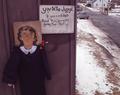
Judge Judy Says...by BeagleboyComment: I know this isn't the greatest, but I believe that it still didn't deserve five 1's and twelve 2's. At least I had some originality and didn't shoot some stupid STOP sign or a basic street sign. Like my Photographer Comments says...  Message edited by author 2004-02-01 12:26:56. Message edited by author 2004-02-01 12:26:56. |
| 02/01/2004 10:40:54 AM |
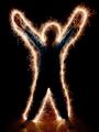
Sparkling personality by timmiComment: THE most interesting shot for this challenge. Great idea! This is top-3 guaranteed in my book. I hope you didn't damage your nice floor with the sparks |
 Photographer found comment helpful. Photographer found comment helpful. |
| 02/01/2004 10:39:03 AM |
James Bond's Assassinationby labudsComment: Interesting image, but I would have prefrerred just seeing the oilve pit lit up the way you have it now, but without that red tracer. |
| Photographer found comment helpful. |
| 01/30/2004 06:47:48 AM |
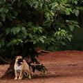
Dogby GinaRothfelsComment: This should have finished higher. The crop you selected really puts emphasis on the pug's size. Don't mind the comments about the bush being too important in the shot. The eye is drawn to the dog, which is what should be happening to pull this shot off. Good work. Keep it up! |
| Photographer found comment helpful. |
| 01/30/2004 06:43:48 AM |
|
| Photographer found comment helpful. |
| 01/30/2004 06:41:14 AM |
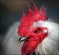
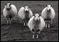
Four of a Kind by KonadorComment: Great work Konador. I had this image pegged for first place. Congrats on another ribbon. Keep it up, buddy! |
| Photographer found comment helpful. |
| 01/28/2004 02:20:24 PM |
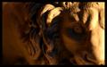
Leoby cainnComment: Nice idea and composition, but the most important part of the shot, the statue's eye, is out of focus. Looks like the camera focussed on the edge of the mane instead. I would have rather seen the tip of the nose to the eye in focus with the rest blurred by the DOF. I like the lighting colour. I would have also cropped out more of that "dead space" on the left. |
| 01/28/2004 02:11:18 PM |
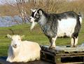
Capricorn in Ascensionby ciaranComment: Funky little goats. Many white spots in their fur are overexposed. Goat on left seems a bit out of focus |
| Photographer found comment helpful. |
| 01/28/2004 02:05:12 PM |
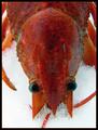
Cancerby MonaComment: Top of the crawfish's seems out of focus. Interesting subject matter. Not too crazy about that thin red line in the border: loses its intensity along quite a few spots around the edge of the image.. Plain black would have been better. |
| Photographer found comment helpful. |
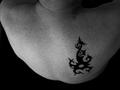
| 01/28/2004 02:03:00 PM |
Bornean Scorpioby flip89Comment: Way cool tatoo. I love the use of negative balck space, but I find the angle of this shot too steep. Creates a weird effect and makes the left shoulder blade look abnormal. |
| Photographer found comment helpful. |
Home -
Challenges -
Community -
League -
Photos -
Cameras -
Lenses -
Learn -
Help -
Terms of Use -
Privacy -
Top ^
DPChallenge, and website content and design, Copyright © 2001-2025 Challenging Technologies, LLC.
All digital photo copyrights belong to the photographers and may not be used without permission.
Current Server Time: 08/06/2025 07:30:01 AM EDT.