| Image |
Comment |
| 06/28/2015 03:27:12 PM |
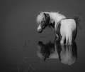
Cloudy with a Chance of Meatballs!by JayneRyanComment: Hi Jayne,
This comment is part of my participation in the DPC Critique Club. This is a strong composition, set in a surprising (in a good way) tableau. The graceful lines of the pony's gaze backward and the rippled abstraction of the reflections all add to the impact. What I'm less certain about are your exposure/basic toning choices. On my monitor, even at full brightness, the highlights all tend to gray. While there are some areas of deep shadow/black, they seem to be in small proportion to the overall image. Taken together with the expanse of dark grey water, the overall effect is one of tonal similarity. I also notice that the reeds on the far right provide a minor distraction due to their overlap with the pony and those in the blurred foreground, draw my attention, too, and might be fairly easily removed in PP. Overall, the appeal is strong and the subject/composition trump the negatives I've noted to make this a strong shot, with potential to be improved with a bit more time in editing. |
 Photographer found comment helpful. Photographer found comment helpful. |
| 06/28/2015 03:09:18 PM |
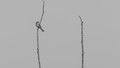
Observerby riotComment: Hey Eugene,
This comment is part of my participation in the DPC Critique Club. There are more things I find to be striking about this shot than things that detract. What I really like is the dramatic lighting and bold compositional choices that include generous amount of shadow above the subject and the splash of color on the right. In combination with the spider's apparent upward glance, this becomes a powerful tableau with a touch of mystery. The primary negative for me is the soft focus on the main subject. I suspect this may be a result of the setup and the optics you were working with, or perhaps an artifact of diffusion created at f/18. But it's a small criticism on a very strong image. |
| Photographer found comment helpful. |
| 06/28/2015 01:31:41 PM |
Waitingby ShaneBlakeComment: Simplicity and balance. A remarkable image. Back on rollover day to offer some BTC bling:
 |
| Photographer found comment helpful. |
| 06/28/2015 01:29:36 PM |
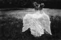
Prayersby neenee1999Comment: I'm enjoying being part of the DPL "First 10" Challenge. Yours is photo #10 in my random voting stream.
Very nice take on the theme. Love the composition and the posture. I'm not at all sure I want her to be praying, though. I'm enjoying a moment imaging what might be in her hands that has captured her attention. Kudos.
Back on rollover day to add some bling. The BTC Red for you:
 |
| 06/28/2015 01:28:43 PM |
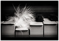
DoWNby h2Comment: Bingo! A great take on the challenge, and so well executed. The best pianists need the ability to play with fingers like hammers and fingers like feathers.
Back on rollover day: This holds up to repeated viewing. My favorite for the challenge. A BTC Blue for you.
 |
| Photographer found comment helpful. |
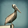
| 06/28/2015 01:28:39 PM |
Pelecanus Occidentalisby AliciaComment: This has been processed in a way that bridges the ether between photo and graphic design. What could have been banal and cliche is improved greatly by the PP work. Well done!
Back on rollover day to add some bling:
|
| Photographer found comment helpful. |
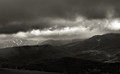
| 06/27/2015 09:23:56 PM |
Gran Sasso frownsby olbolComment: Hi olbol,
This comment is part of my participation in the DPC Critique Club. There's a big backlog of images with requested critiques, sorry for the delay.
This is a really dramatic and evocative image. I like your color choice in the conversion toning very much. I wonder about the exposure or image brightness, though. I have my monitor cranked up all the way and it's still fairly dark... wondering if it lost some shadow details when viewers weren't at full monitor brightness. On the other hand, the image is meant to be dark and foreboding, I imagine. One suggestion I have that might be effective is to crop off the top at about 1 inch (or about 20%). The wider aspect ratio along with removing some of the nondescript grey clouds at the top could add to the impact. Clearly that's just a personal preference, this is a strong image as it stands. Nicely done! |
| Photographer found comment helpful. |
| 06/27/2015 09:10:56 PM |
Sun and cloudsby gminkComment: Hi Gaylord,
This comment is part of my participation in the Critique Club. There's a big backlog on requests, sorry for the delay. So...
The drama in this scene is clear. The figure/ground of the two diagonal parts of the photo are well seen and composed. But.. the overall effect is damaged by the excessive saturation and the color noise within the blues and yellows. I'm also wondering who tightly cropped this is - I suspect from the lack of detail that it's a pretty small portion of the overall image. I'll finish by restating that the lines and composition are great. The colors are complementary and would work well together. If this were sharper, desaturated a bunch and lacked the color artifacts (particularly in the blues) it would be a much stronger image. You really don't need the exaggerated colors to create a dramatic image. |
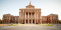
| 06/27/2015 08:54:56 PM |
Texas State Capitolby MEJazzComment: Hi Mansoor,
This is Bill Banning comment as part of the DPC Critique Club. We're all caught up on current challenges and now a few of us are taking on more recent requests that didn't get covered. So..
This is a competent photo that shows a building for what it is. Your timing worked well to avoid distracting elements in the shot and as Melethia commented, the mirrored cars are a cool part of the setting. The exposure is right on and the afternoon (or morning?) light is good, too. For me, what's lacking is any compelling interest other than the building itself. There's also some typical wide angle distortion going on (both the converging verticals at the far sides and some central distortion causing the image to appear to be bulgiing outward. This can be fixed in current versions of LR or PS or even with Adobe Camera Raw. But the bottom line is that even if the distortion were completely gone, it there's still not much interest in just a straight on shot of a building, even a beautiful historic one like this. |
| Photographer found comment helpful. |
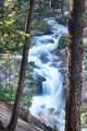
| 06/27/2015 08:21:30 PM |
Helen Hunt Fallsby MddoaneComment: Hi Michael,
This comment comes from my role as a member of the DPC Critique Club. There's a big backlog of requests, so sorry for the delay.
I appreciate this attempt at HDR using Nik HDR Efex - I use the Nik filters often and can presume what your tone-mapping intent was. First, let me compliment the composition. The curves of the stream are nicely framed by the natural borders of the trees. The shutter speed works to soften the cascading water, too. What doesn't work is the lack of sharpness throughout the image. It's not clear to me if this is a result for soft focus on one or more of your 5 source images, or if it's an artifact of the HDR merge. I might suggest reprocessing using only three exposures. I find that the +/- 1 or 1.5 over three images is sufficient in most cases. Sorry to not be of more help on the image softness. |
Home -
Challenges -
Community -
League -
Photos -
Cameras -
Lenses -
Learn -
Help -
Terms of Use -
Privacy -
Top ^
DPChallenge, and website content and design, Copyright © 2001-2025 Challenging Technologies, LLC.
All digital photo copyrights belong to the photographers and may not be used without permission.
Current Server Time: 08/11/2025 10:55:42 PM EDT.