| Image |
Comment |
| 04/28/2010 06:13:38 PM |
untitledby jonksterComment: I have mixed feelings about this one. The composition without the hands would have been perfect for my taste, the lighting is great, but the hands are too blurry and remind me more of someone typing really really quickly more than of a double exposure. I'm not sure if you used a flash for this one, but a secondary flash to light up the hands would have eliminated what looks like motion blur on them. |
 Photographer found comment helpful. Photographer found comment helpful. |
| 04/28/2010 06:10:19 PM |
Keeping vigilby LonnieDComment: Great idea! The lighting of the subject(s) is perfect and really gives me a creepy feeling. The flares from the street lamp are distracting, however. |
| Photographer found comment helpful. |
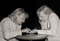
| 04/28/2010 06:07:32 PM |
The Palm Readerby hahn23Comment: This is an interesting one, the facial expressions seem very realistic and the positioning is excellent. The table seems to have tilted slightly on the second exposure, perhaps you could have found a more stable table/surface. |
| Photographer found comment helpful. |
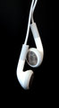
| 04/26/2010 09:08:32 PM |
Condom of Zenby NordiyComment: Nice photo, but the power lines are distracting (and the title is distracting, confusing and weird at the same time, which isn't necessarily a bad thing) |
| Photographer found comment helpful. |
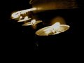
| 04/26/2010 08:29:43 PM |
THE MELTING OF THE WATERS (CW)by kiwinickComment: I think the exposure could have been longer and it might have helped the overall tone of the photo. Also, the plant could have been moved more off-center to help the composition (off the vertical axis, to the left for example). Apart from that, this is one of the photos that do speak Zen to me on some level, especially the water interacting with the lower part of the plant. |
| Photographer found comment helpful. |
| 04/26/2010 07:49:48 PM |
My Escapeby WallitComment: I'm not sure if you could have done anything about it under the rules, but the L and R markings are a little bit distractive here. I really like the simplicity of this apart from that tiny distraction. |
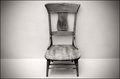
| 04/26/2010 07:39:38 PM |
"Form is emptiness, and emptiness is form"by 2mccsComment: I'm really not sure, but this might have been better if the composition wasn't central. This way i have the feeling that the chair is staring at me instead of inviting me to look at it :) |
| Photographer found comment helpful. |
| 04/26/2010 07:33:46 PM |
|
| Photographer found comment helpful. |
| 04/26/2010 07:30:26 PM |
Peacefulby kitkatklokComment: Really love the idea and the execution. Also, a very harmonious composition. |
| Photographer found comment helpful. |
| 04/26/2010 07:28:09 PM |
Graceby ltlmschrisssComment: I really like the composition on this one. The only thing that is mildly distracting is the graduated border, but i'm not sure if a different border would look better on it anyway. |
| Photographer found comment helpful. |
Home -
Challenges -
Community -
League -
Photos -
Cameras -
Lenses -
Learn -
Help -
Terms of Use -
Privacy -
Top ^
DPChallenge, and website content and design, Copyright © 2001-2025 Challenging Technologies, LLC.
All digital photo copyrights belong to the photographers and may not be used without permission.
Current Server Time: 08/04/2025 12:54:41 PM EDT.