| Image |
Comment |
| 11/07/2010 09:20:36 PM |
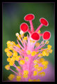
Awarenessby FocusPointComment: I really love the vibrant colors of this, and I actually love how the red circles are NOT in focus. It has cool effect. One of my favorite plant images in this challenge 8 |
 Photographer found comment helpful. Photographer found comment helpful. |
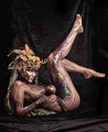
| 11/07/2010 09:19:38 PM |
Woodland Dryadby dsa157Comment: Very cool. I love the intricate body art. I do think that that ball is rather random though and distracts from her 7 |
| Photographer found comment helpful. |
| 11/07/2010 09:18:37 PM |
tiptoeby sidpixelComment: Love this shot. The sillhoette almost looks like a doll rather than a child. Great use of negative space. 8 |
| Photographer found comment helpful. |
| 11/07/2010 09:15:25 PM |
|
| Photographer found comment helpful. |
| 11/07/2010 07:45:00 PM |
Escapeeby davidwComment: This is fantastic in its simplicity. One of the few situations where the harsher lighting actually enhances the photograph. It really brings out the textures here.
I would have cloned or cropped out the stumpy thing on the left, if that is at all possible, as it is rather distracting.
I can see this handing on a wall. 8 |
| Photographer found comment helpful. |
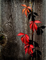
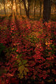
| 11/07/2010 07:42:02 PM |
Red by bobccComment: Wonderful play of light. You have a great eye.
I don't think that the lower third of the image is necessary though. It doesn't really add anything to the photograph. The top third, now THAT is sublime 7 |
| Photographer found comment helpful. |
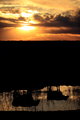
| 11/07/2010 07:39:09 PM |
Pulse Widthby dx_powerComment: This is eirie! The purple starlit sky, the fact that only the boats are visible and the dark dark reflection in the water makes it almost seem like it was taken on another planet. Wonderfully done! I would have edited out the splotchy things in the water, especially in the bottom left corner. 9 |
| Photographer found comment helpful. |
| 11/07/2010 07:12:43 PM |
Hogwartsby dianapf1Comment: Great processing! Almost feels like a drawing to me, and the powerful black and white really gives the castle a looming feel. I don't really like the slanted tower in the top right corner, but agree that the right boulder needed to be included composition wise, so I don't know how that could have been fixed. Great shot! 9 |
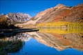
| 11/07/2010 07:08:15 PM |
Autumn in the foothillsby ChandiComment: Lovely place, but the image comes off overall as far too bright. I wouldn't go so far too say overexposed, as you kept the details in the mountain. But it is still quite...glaring. |
| Photographer found comment helpful. |
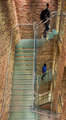
| 11/07/2010 07:05:03 PM |
Going Upby DistantColoursComment: I really like the lines and symmetry of this image, but the man needs to be a lot sharper in order to be truly effective. The blurriness takes away most of the impact that this image could have. I suggest you go reshoot this. There is definitely something interesting here. 5 |
| Photographer found comment helpful. |
Home -
Challenges -
Community -
League -
Photos -
Cameras -
Lenses -
Learn -
Help -
Terms of Use -
Privacy -
Top ^
DPChallenge, and website content and design, Copyright © 2001-2025 Challenging Technologies, LLC.
All digital photo copyrights belong to the photographers and may not be used without permission.
Current Server Time: 08/06/2025 09:26:07 AM EDT.