| Image |
Comment |
| 09/06/2015 08:38:40 PM |
Still life by NeatComment: This is a specimen example for a still life shot! You nailed it! If I could vote it would be a ten! This is definitely my choice for blue... Awesome. |
 Photographer found comment helpful. Photographer found comment helpful. |
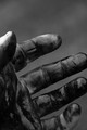
| 08/26/2015 08:10:33 PM |
Dirtyby mrbig65Comment: Nice and oily!! The portrait orientation makes me feel this image is constrained. Great texture and tones to show the filth! |
| Photographer found comment helpful. |
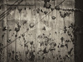
| 08/26/2015 08:06:27 PM |
downby tvsometimeComment: Paint goes up... Paint comes down!Textures, shadows, tones... what's not to like?? |
| Photographer found comment helpful. |
| 08/24/2015 08:02:16 AM |
any given mondayby tateComment: This is so relateable! You got the line of traffic, blinding sun, the construction zone, the added compositional dynamic of liquid... all that's missing is the coffee in hand! But hey, you were taking a picture... so +1 for having a distracted driver in the scene!! |
| Photographer found comment helpful. |
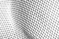
| 08/17/2015 03:14:35 PM |
32 - Sieveby hajekaComment: This lovely abstract macro would look awesome using a focus stack technique!! |
| Photographer found comment helpful. |
| 08/11/2015 09:40:36 AM |
The Guardianby KMcCComment: Nicely done however the selection work needs a little bit of help on the background around the bird.
[Update] I am now seeing this on another computer and the selection area that I referred to above is not showing up. There was a distinct area of grey in the triangle where the legs meets the body. Also in the area of the head... interesting. Will revisit to double check. |
| Photographer found comment helpful. |
| 08/10/2015 09:03:52 PM |
Kiteby PangurbanComment: I'm voting with my daughter on this challenge. She is 6. She wanted to comment on this one... She said "It looks very pretty and colorful! I think it needs to have the string shown leading down." She voted a 9! |
| Photographer found comment helpful. |
| 07/01/2015 11:55:29 AM |
Slashing Pumpkinsby FromDaRockComment: Great subject. I think the person needs a touch more light on them to separate them from the dark background. Possibly some back lighting and a little more from the side. |
| Photographer found comment helpful. |
| 07/01/2015 11:50:56 AM |
blinkby RKTComment: The eyes are on the thirds I know, however this technique better represents a "fill the frame" composition. |
| Photographer found comment helpful. |
| 07/01/2015 11:47:50 AM |
|
| Photographer found comment helpful. |
Home -
Challenges -
Community -
League -
Photos -
Cameras -
Lenses -
Learn -
Help -
Terms of Use -
Privacy -
Top ^
DPChallenge, and website content and design, Copyright © 2001-2025 Challenging Technologies, LLC.
All digital photo copyrights belong to the photographers and may not be used without permission.
Current Server Time: 12/17/2025 04:26:38 AM EST.