| Image |
Comment |
| 03/31/2010 11:57:06 AM |
Come into my Gardenby LonnieDComment: This has a real neat tilt shift effect going for it. I am presuming it is full scale. Great color and good lighting make this an excellent image and worthy of an honorable mention! |
 Photographer found comment helpful. Photographer found comment helpful. |
| 03/31/2010 11:54:35 AM |
The Blue Pill or the Red Pillby burfinoComment: Anyone who doesn't know Alice in Wonderland won't really get this picture and you are probably getting some DNMC's... I won't be one of them.
The left side of the photo looks slightly OOF with the red pill being a little closer to the camera and the blue pill somewhat farther away, perhaps a slightly higher DoF would bring that in focus. It is only a slight distraction. You got great color and great lighitng with shadows to boot! Overall a good presentation with a twist on the challenge topic. |
| Photographer found comment helpful. |
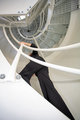
| 03/31/2010 11:34:20 AM |
Stairway to Heavenby BarbBComment: Good leading line going right up the stairway. The perspective and the person adds interest. What is lacking is some color. Did you try a black and white treatment?? |
| Photographer found comment helpful. |
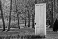
| 03/31/2010 07:48:08 AM |
Entrance to... ??by dragonwarlord98Comment: Good use of leading lines with the bulb plants lined up to the door. Good Depth of field and black and white conversion. Nice placement of the subject in the frame! |
| Photographer found comment helpful. |
| 03/29/2010 09:54:04 AM |
|
| Photographer found comment helpful. |
| 03/28/2010 02:33:41 PM |
Friendsby karmatComment: Very cute little girls. The de-saturated pictures stand out well against the more saturated sky background! What's pretty cool is that all the pictures are looking up... |
| 03/28/2010 02:32:32 PM |
Twinsby karmatComment: Souper funny and a good eye! I like the diptych with the background frame lnes leading you around. |
| 03/27/2010 03:31:33 PM |
Week 08by KenComment: Simple & sharp with very good composition using the angled line to break up the frame. I like it! |
| Photographer found comment helpful. |
| 03/27/2010 03:30:21 PM |
Week 11by KenComment: What a neat abstract... It's knd of got these cow patches goin one with a reflection. Anyway, I like the black and white. It is dark but nt overly dark which is good. |
| Photographer found comment helpful. |
| 03/26/2010 03:33:59 PM |
Must be Prom Dayby gminkComment: It may be true that you took this picture on the person's prom day, but there is nothing in the photo that gives a hint of this to the viewer. So here the title doesn't add anything to the picture. It's a good picture in that it has good color and saturation and it's in focus, but there is nothing interesting about the composition. There was no interesting point of view, no leading lines, no stop action of a water splash, no motion blur of people having a water fight. So I don't want to be harsh in my criticism, but here is an example of a good and average picture. |
Home -
Challenges -
Community -
League -
Photos -
Cameras -
Lenses -
Learn -
Help -
Terms of Use -
Privacy -
Top ^
DPChallenge, and website content and design, Copyright © 2001-2025 Challenging Technologies, LLC.
All digital photo copyrights belong to the photographers and may not be used without permission.
Current Server Time: 09/04/2025 06:17:32 AM EDT.